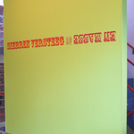
AIB Gallery: "Immersion"
Use keyboard arrows (← and →) or click image to advance.
Another (my last) collaboration with Dean/Director Gary Sangster, and another chance to do the most with the least. For a while I was treating this like a Design 1 project, and literalizing the concept with type. In milk. Too much, of course. Decided that bleeding the type left and right was enough to convey the idea. Can't remember why I got timid with it on the inside of the folding card.
[Missing front of card]
JK, December 2010


