AIB Gallery: "50 Books 50 Covers"
Use keyboard arrows (← and →) or click image to advance.
A touring AIGA event, but we did not lift any of their graphic id. Font Bureau's Agency worked perfectly in its wide/black weight allowing us to make a title graphic out of 4 characters. Design assistance provided by Mike Dolan, esp. for the show catalog [pictures to come].
I helped the Assistant Gallery Director, Andrew Mroczek, with the design of the exhibition. Huge questions about how to make books accessible, but not steal-able. In the end we decided on big tables, chairs, and the honor system, rather than shelves and chains or clamps. (No books were stolen.)
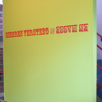
Stencils and paint were used for the wall signage. With lots of bleeding , and thus retouching around the edges, alas.
Expert installer (and Gallery Director) Bonnell Robinson installed all the covers in the entryway, moving left to right, in about half an hour.
Postcard was printed with extra thick card stock and an second hit of black. Loved being able to pair the two square logos. Expected AIGA to squawk, but didn't hear a peep.
Each book had a numbered "bookmark", instead of a label, referencing the description in the catalog.
JK December 2010


