













Boston Modern Orchestra Project: 2004–2005
Use keyboard arrows (← and →) or click image to advance.


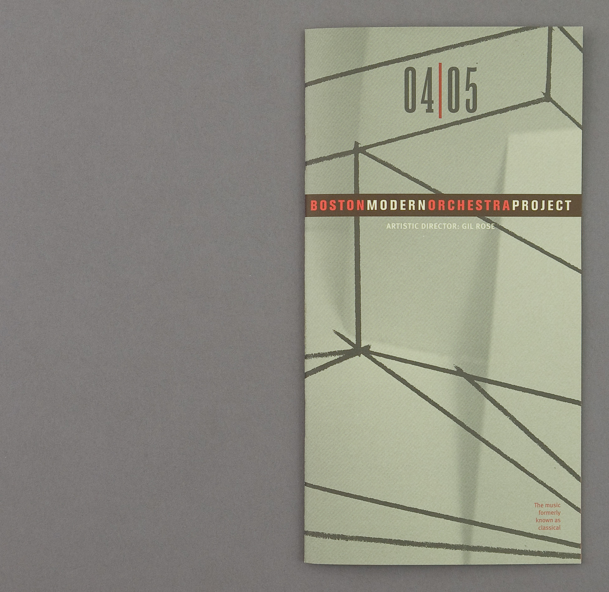
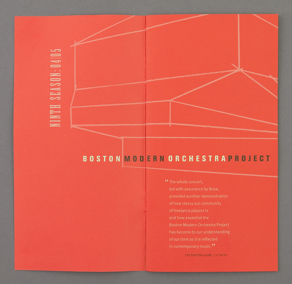
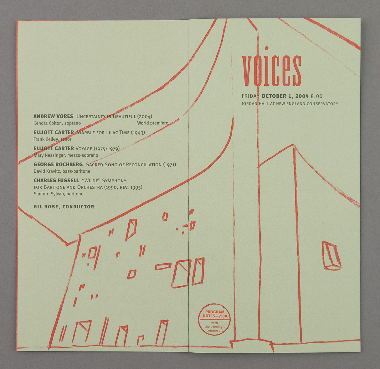
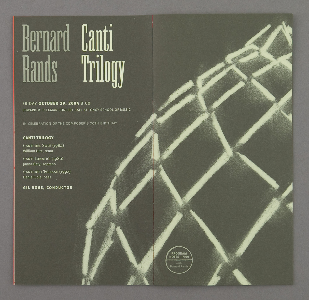
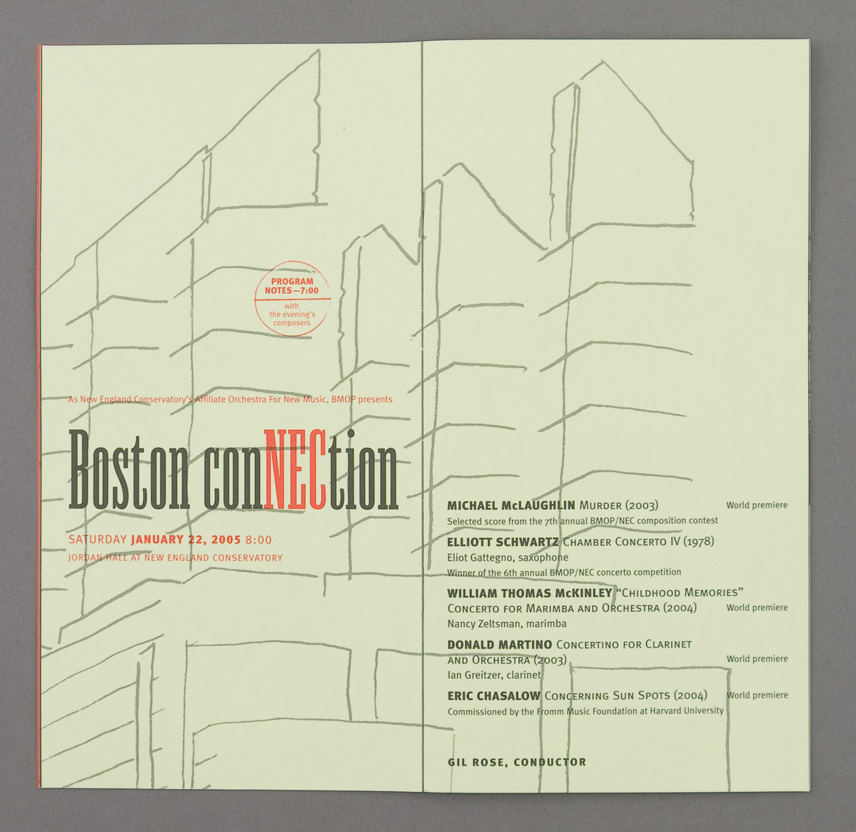
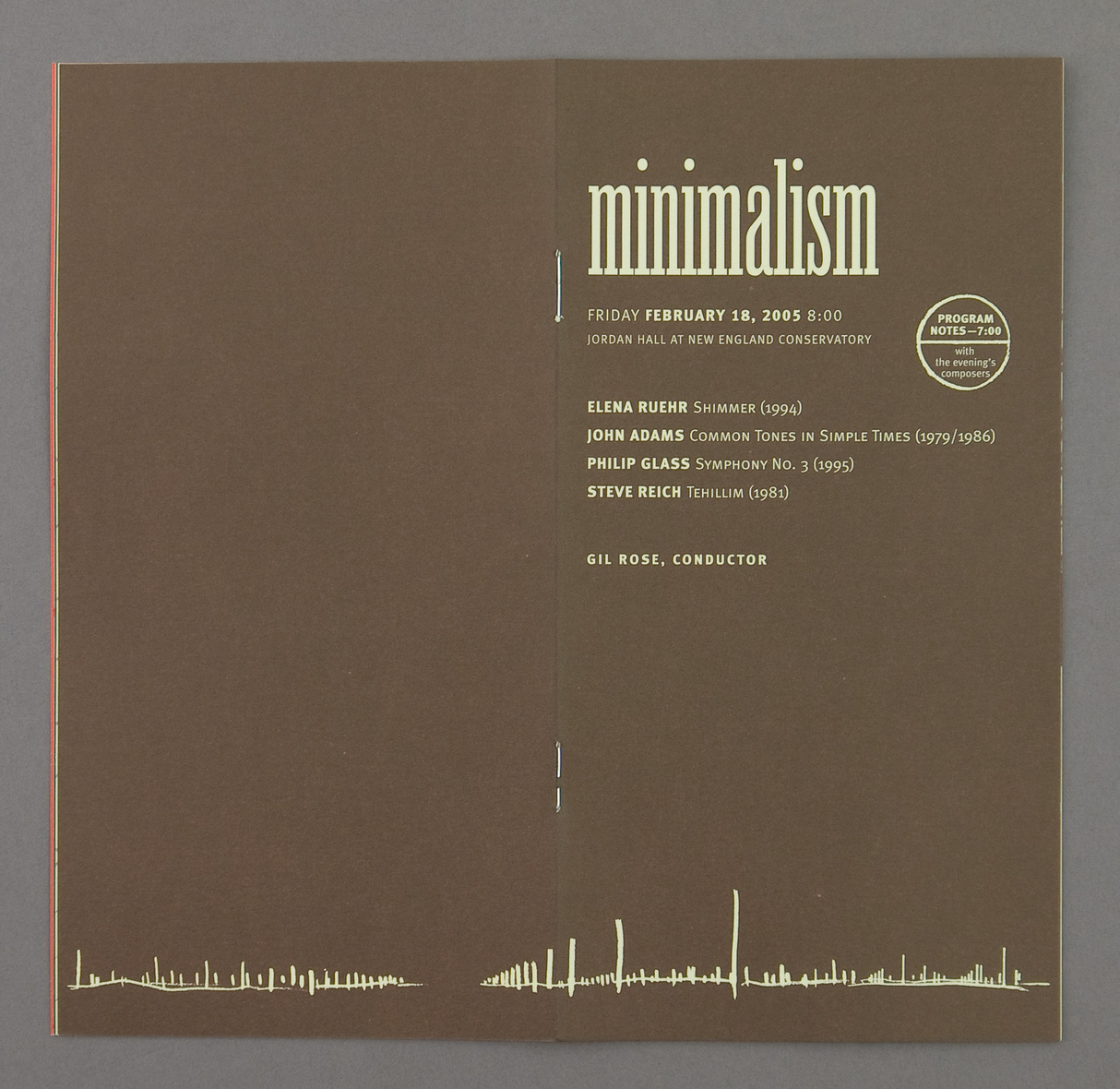
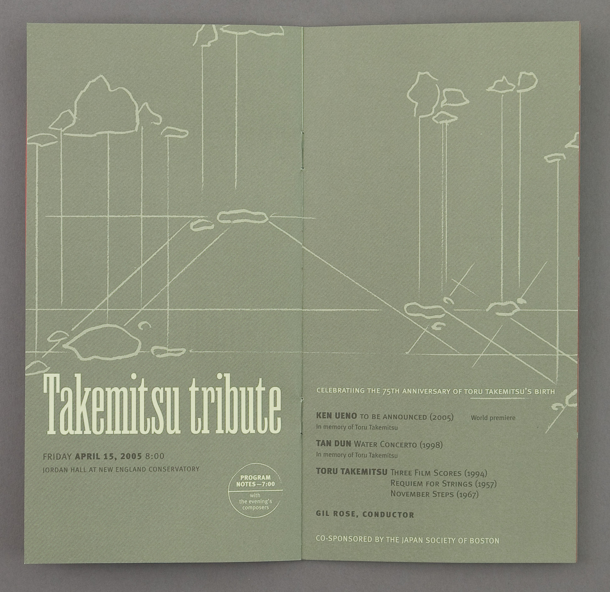
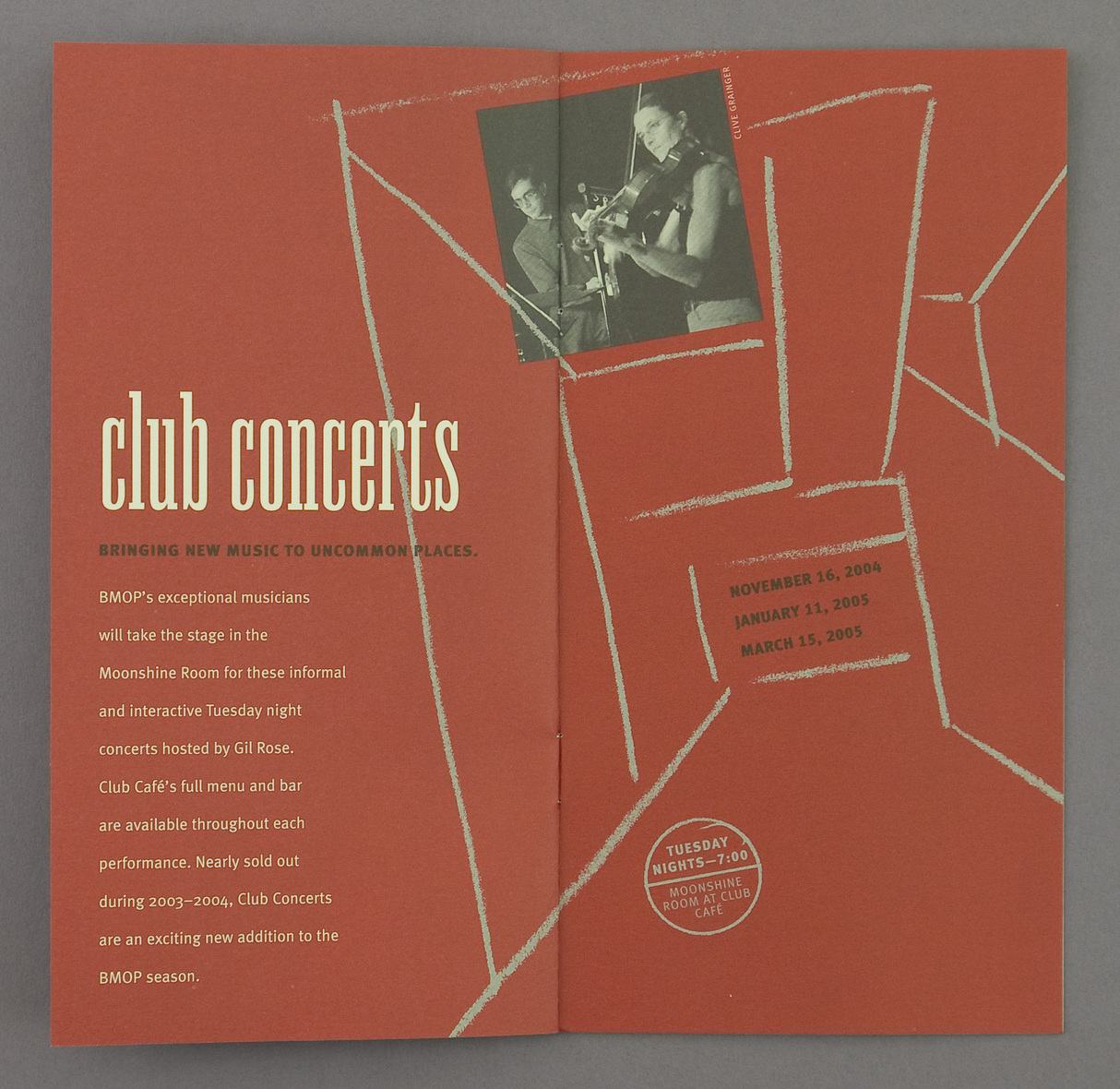
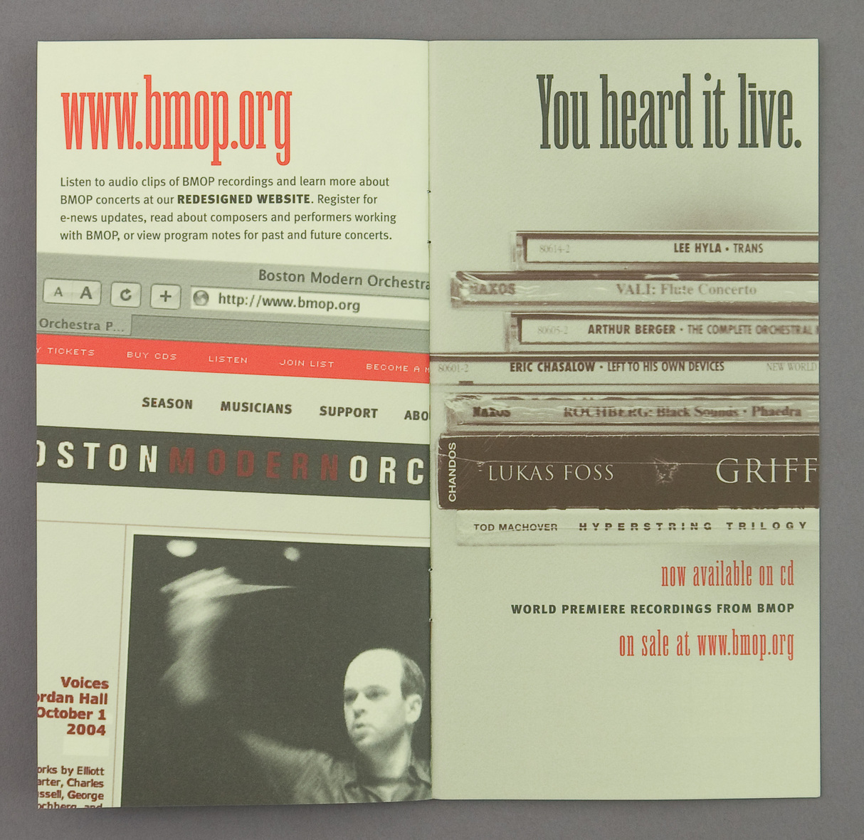
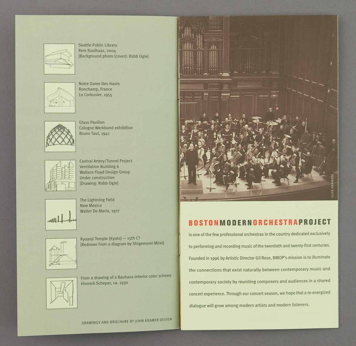
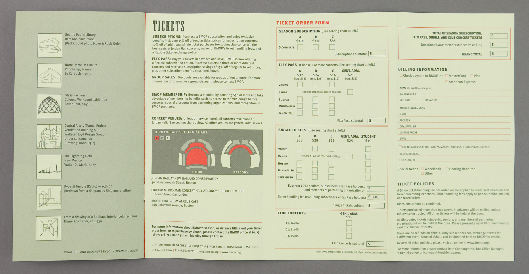
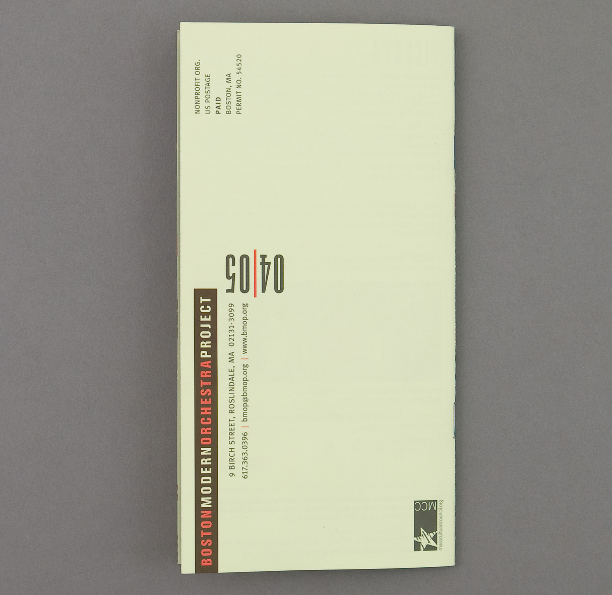
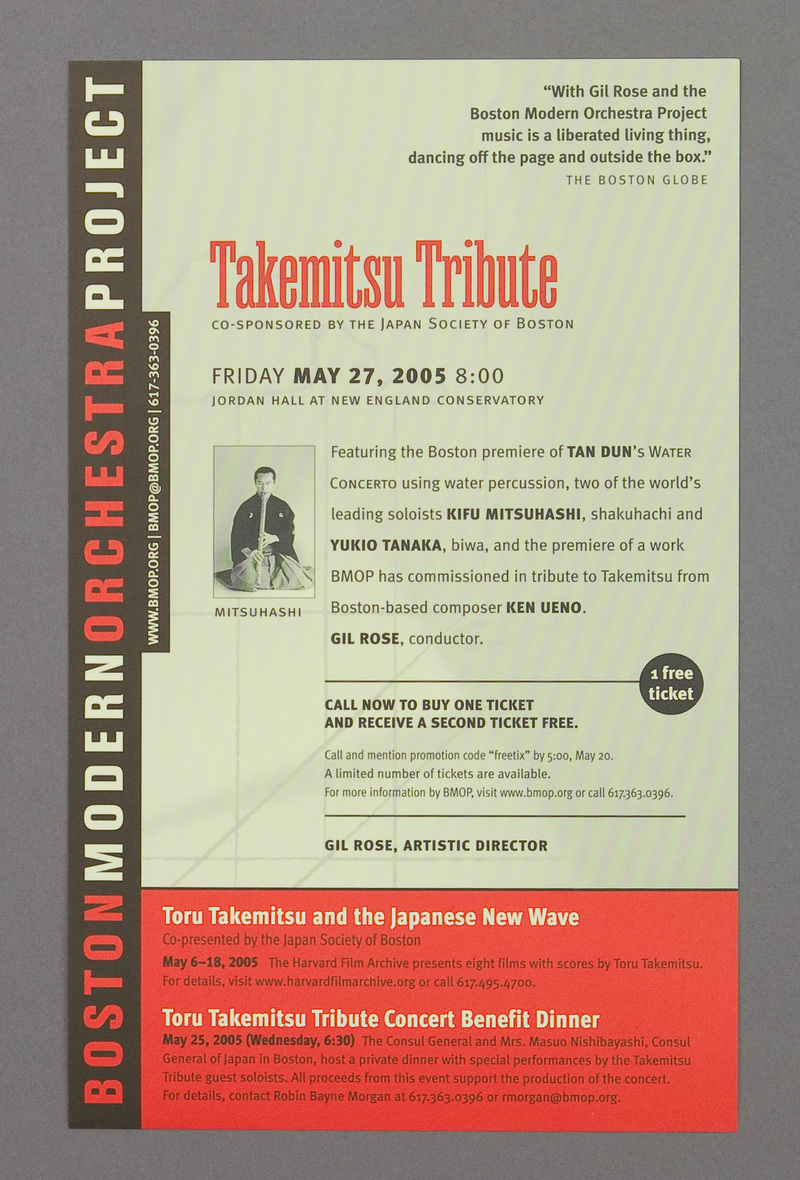
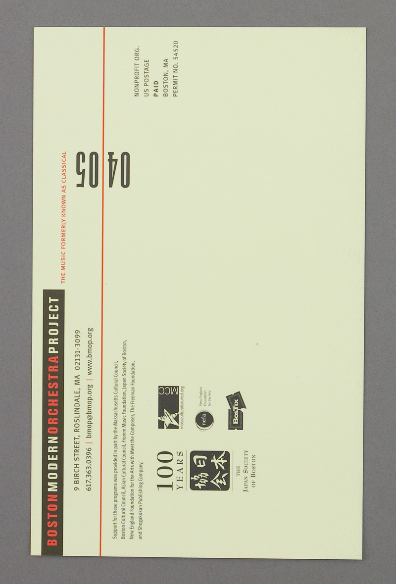
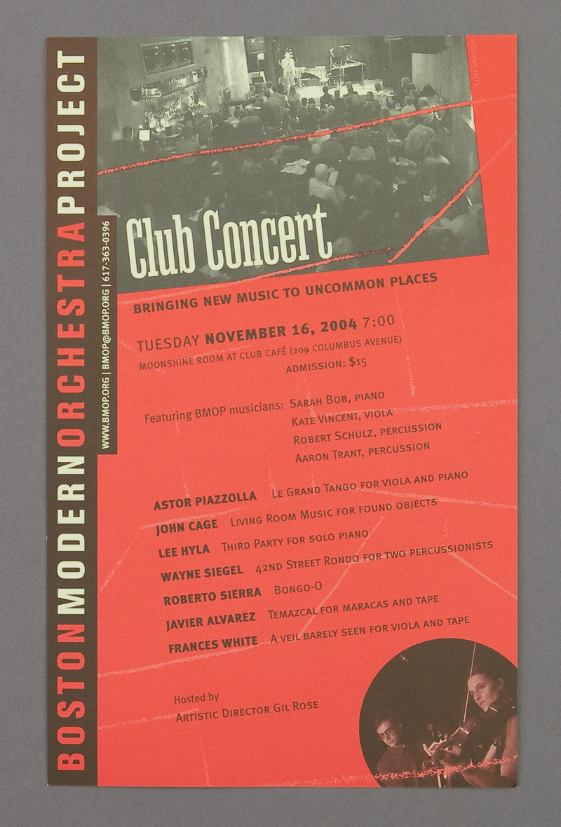
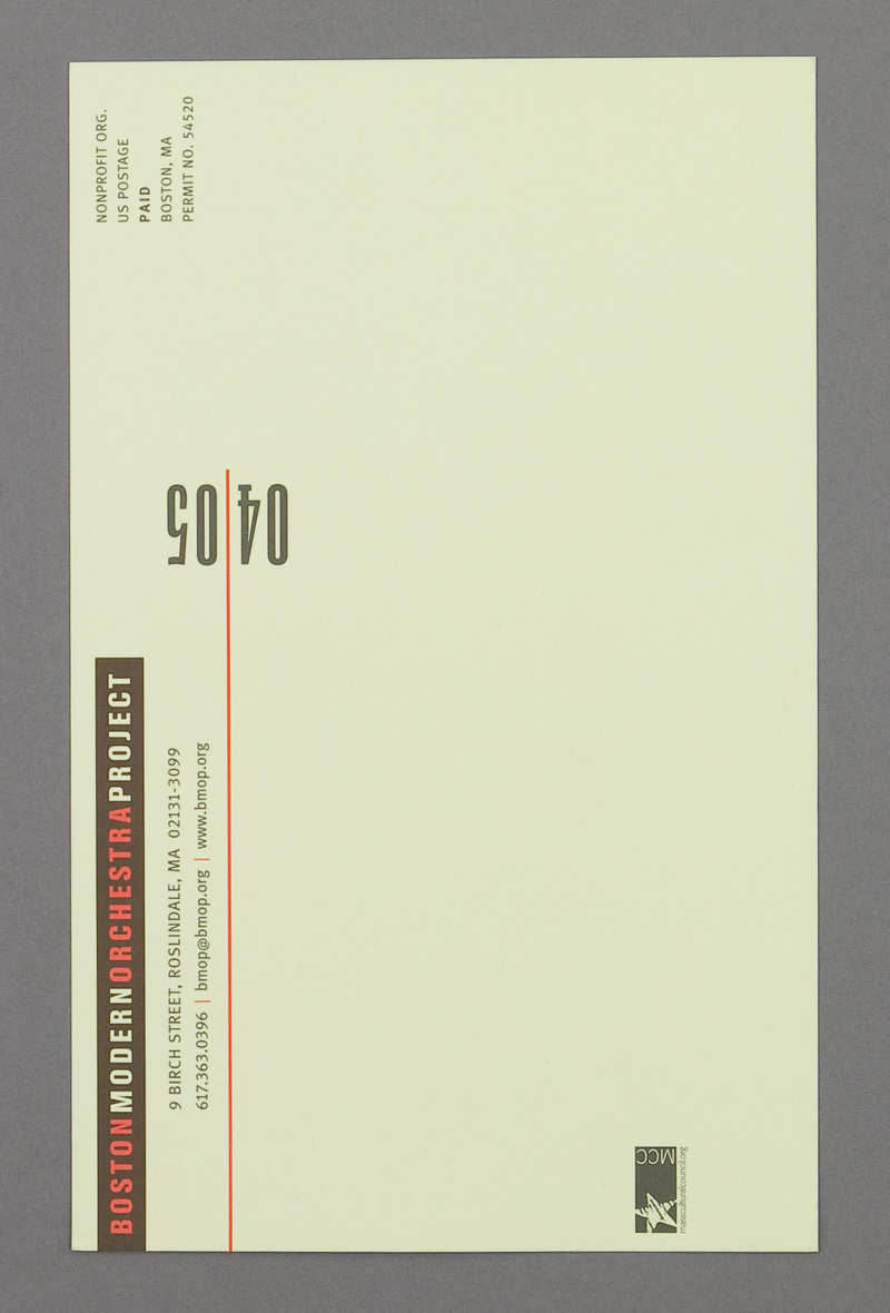
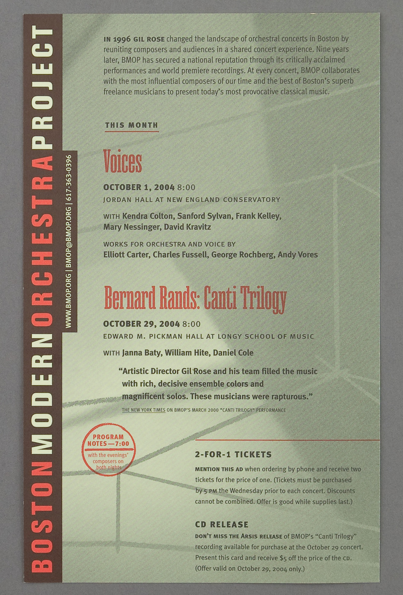
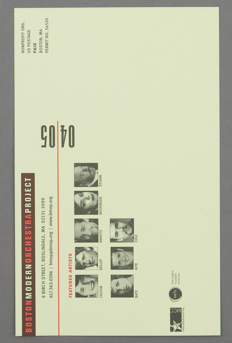
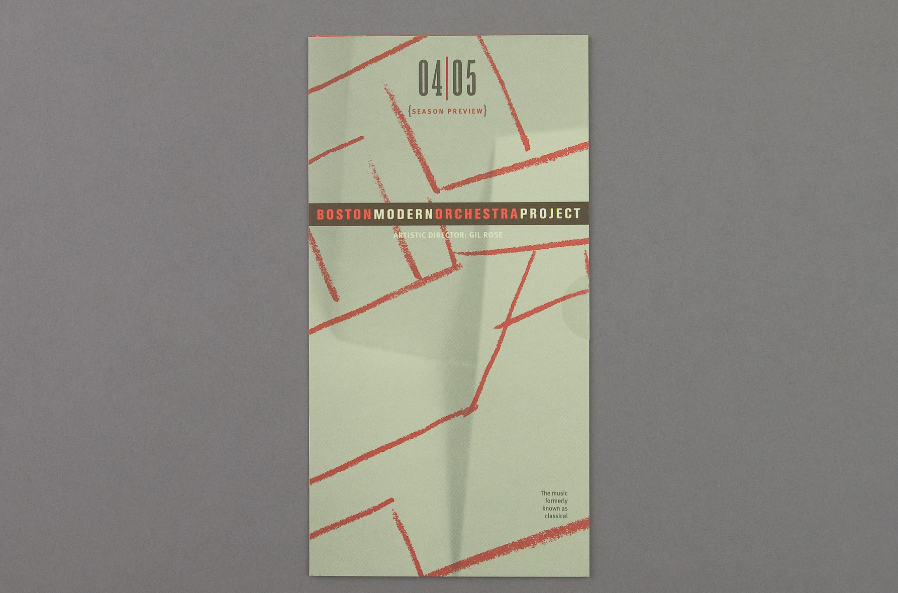
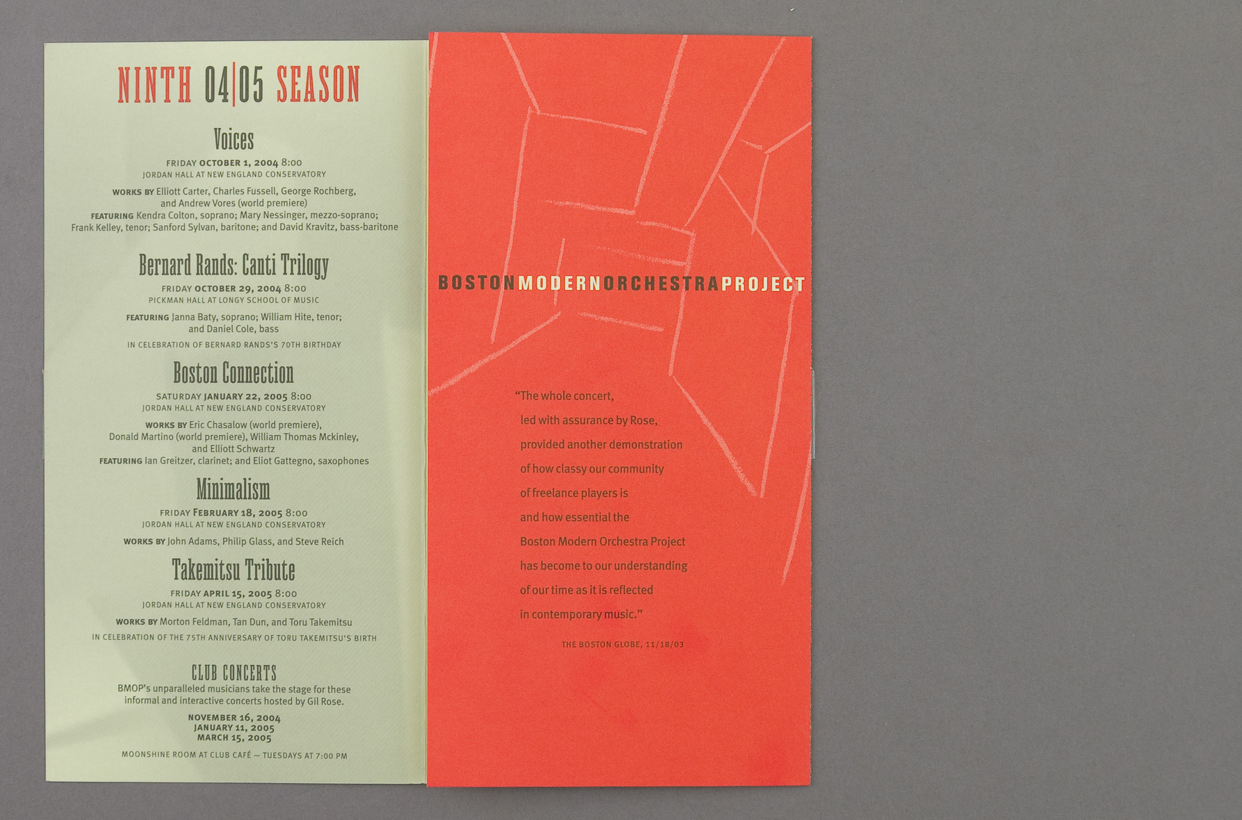
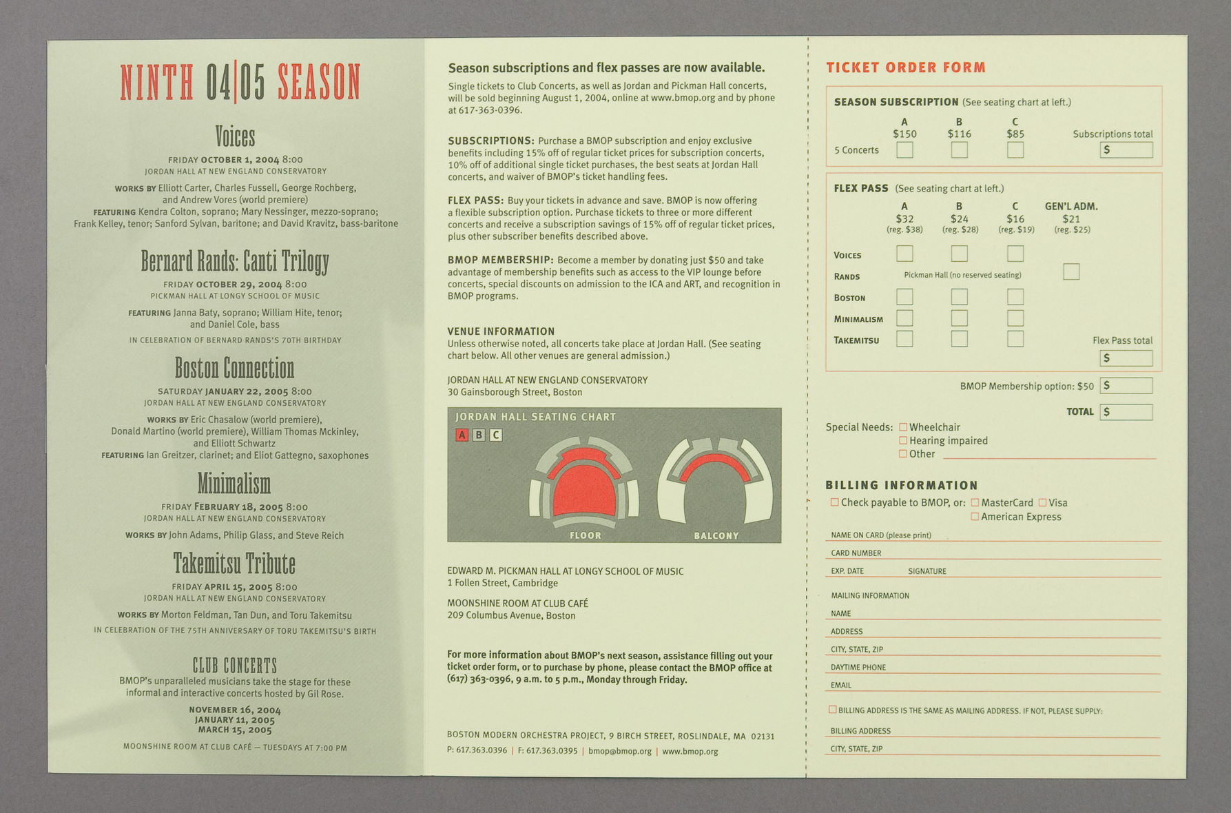
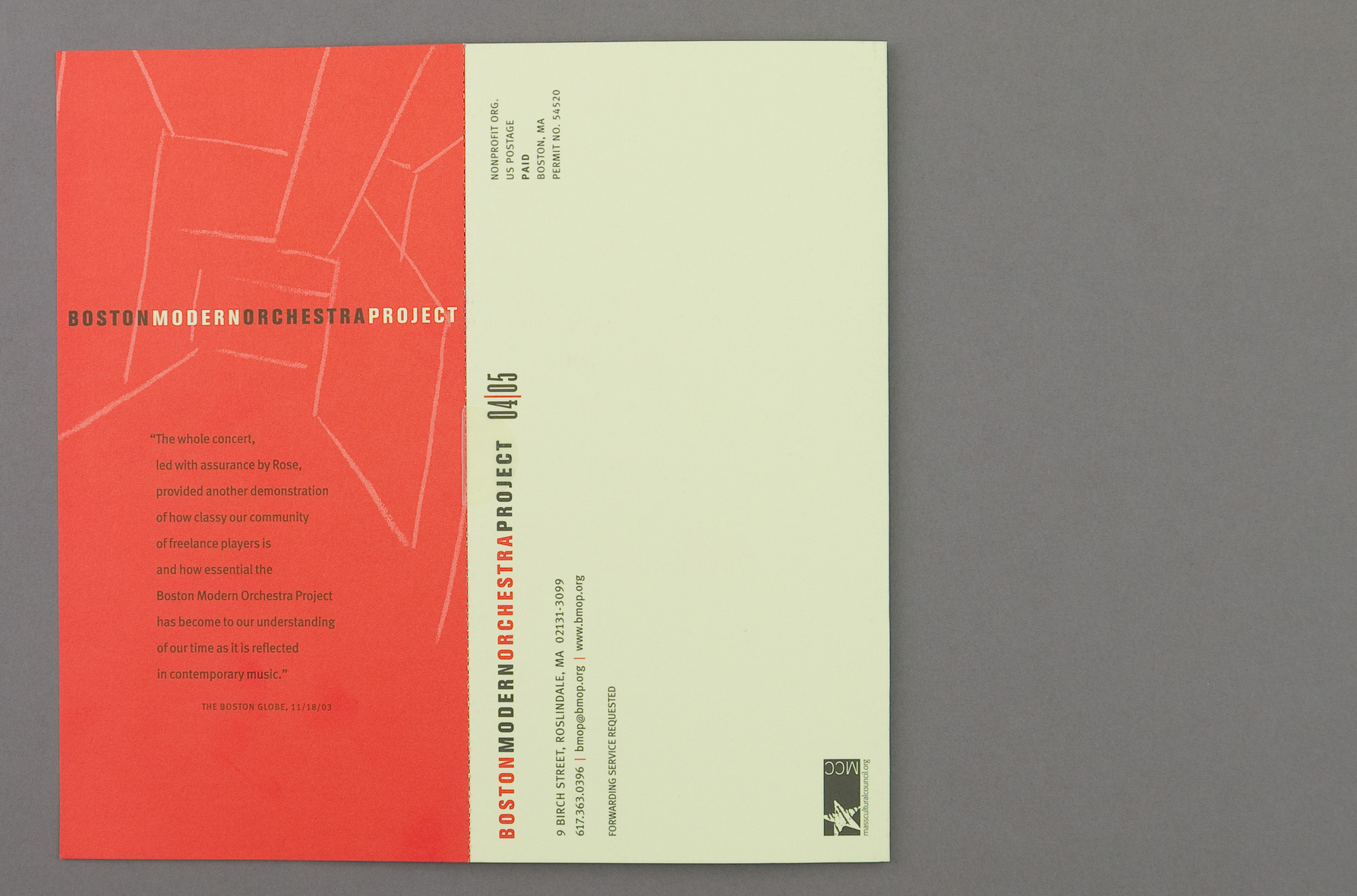
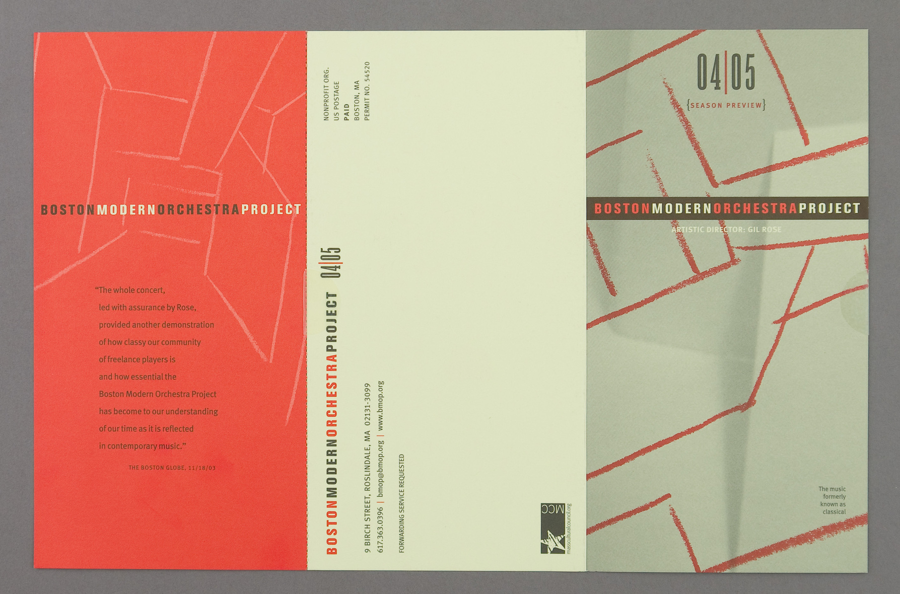
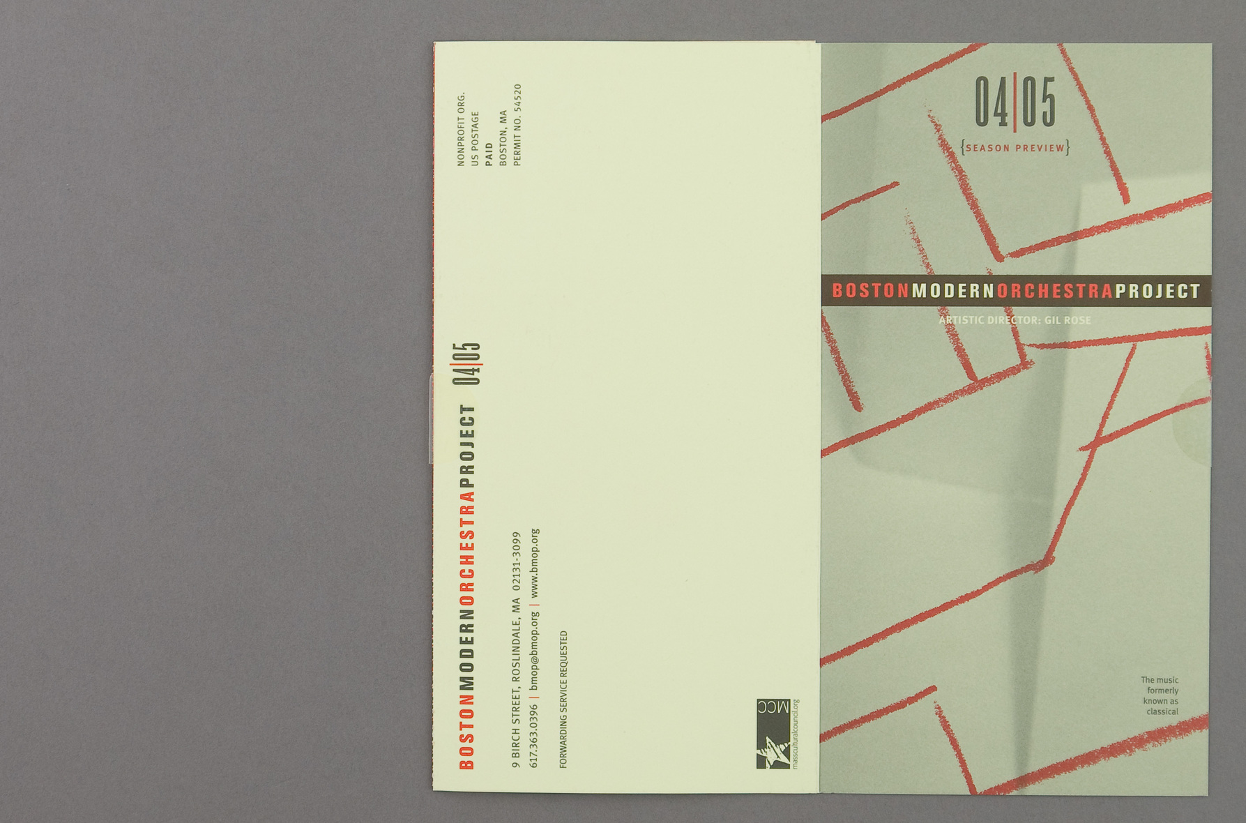
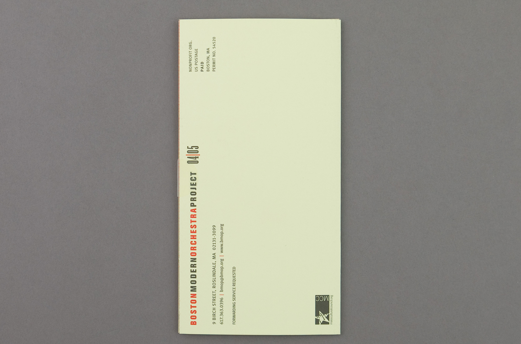
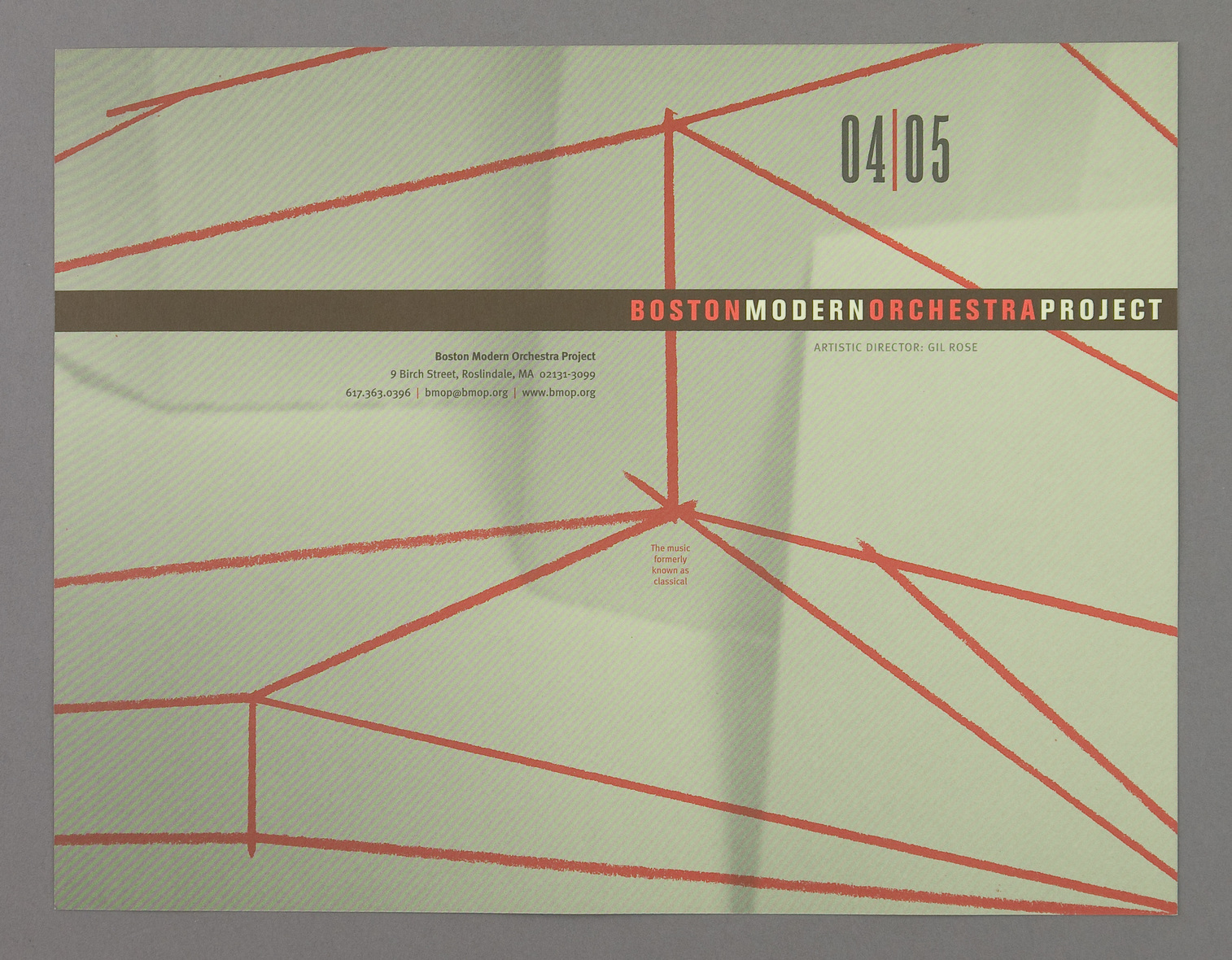
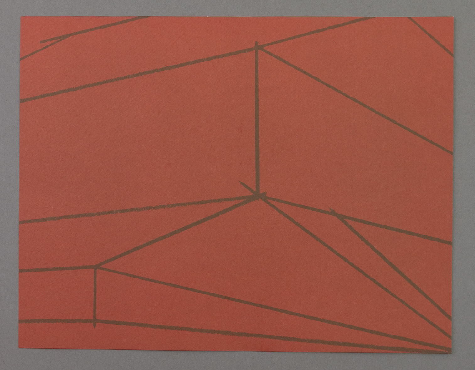
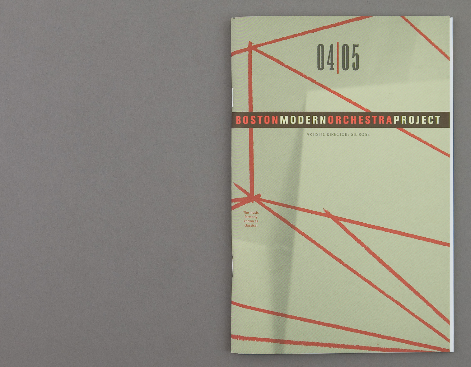
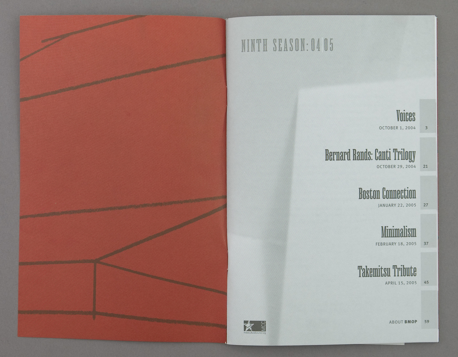
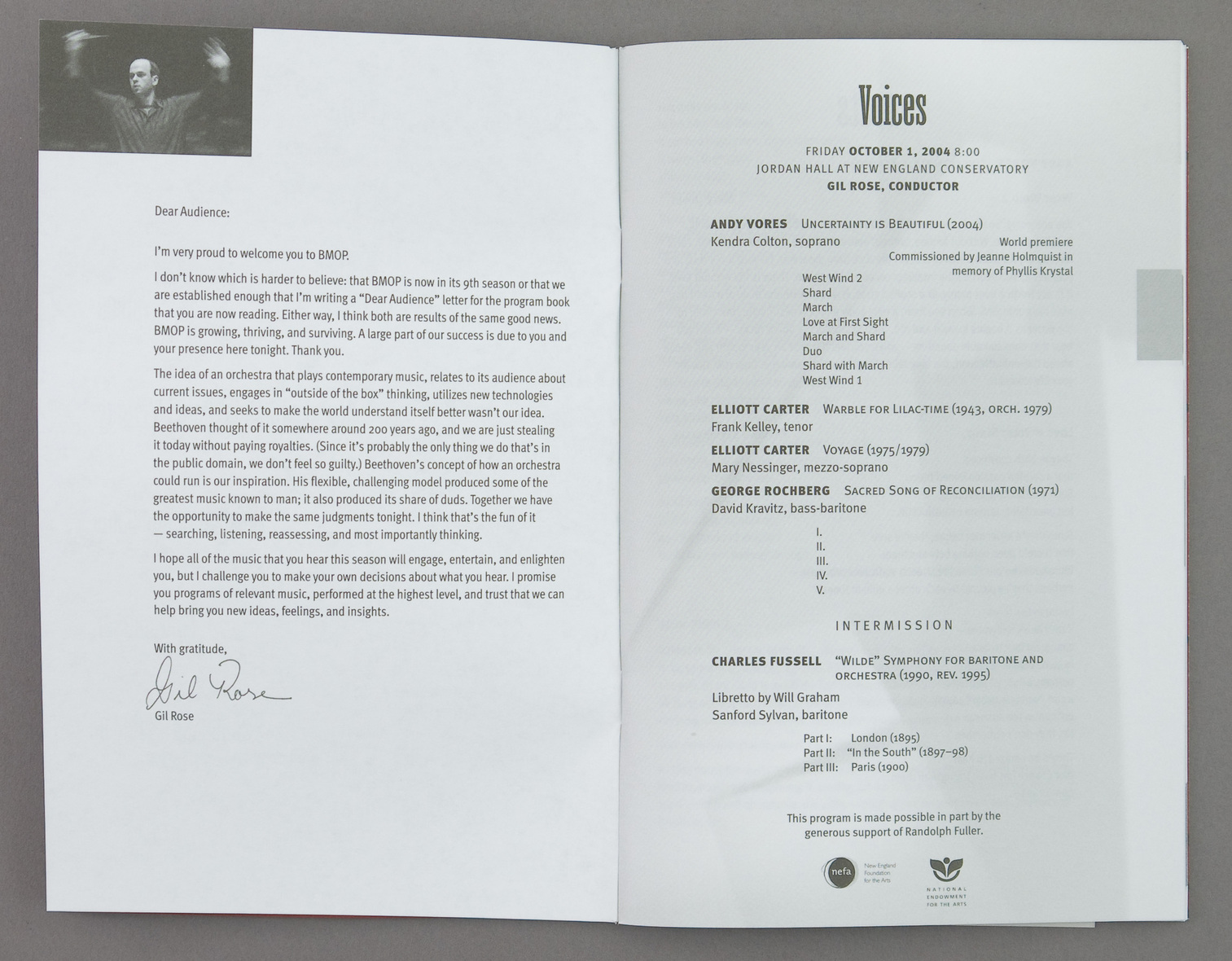
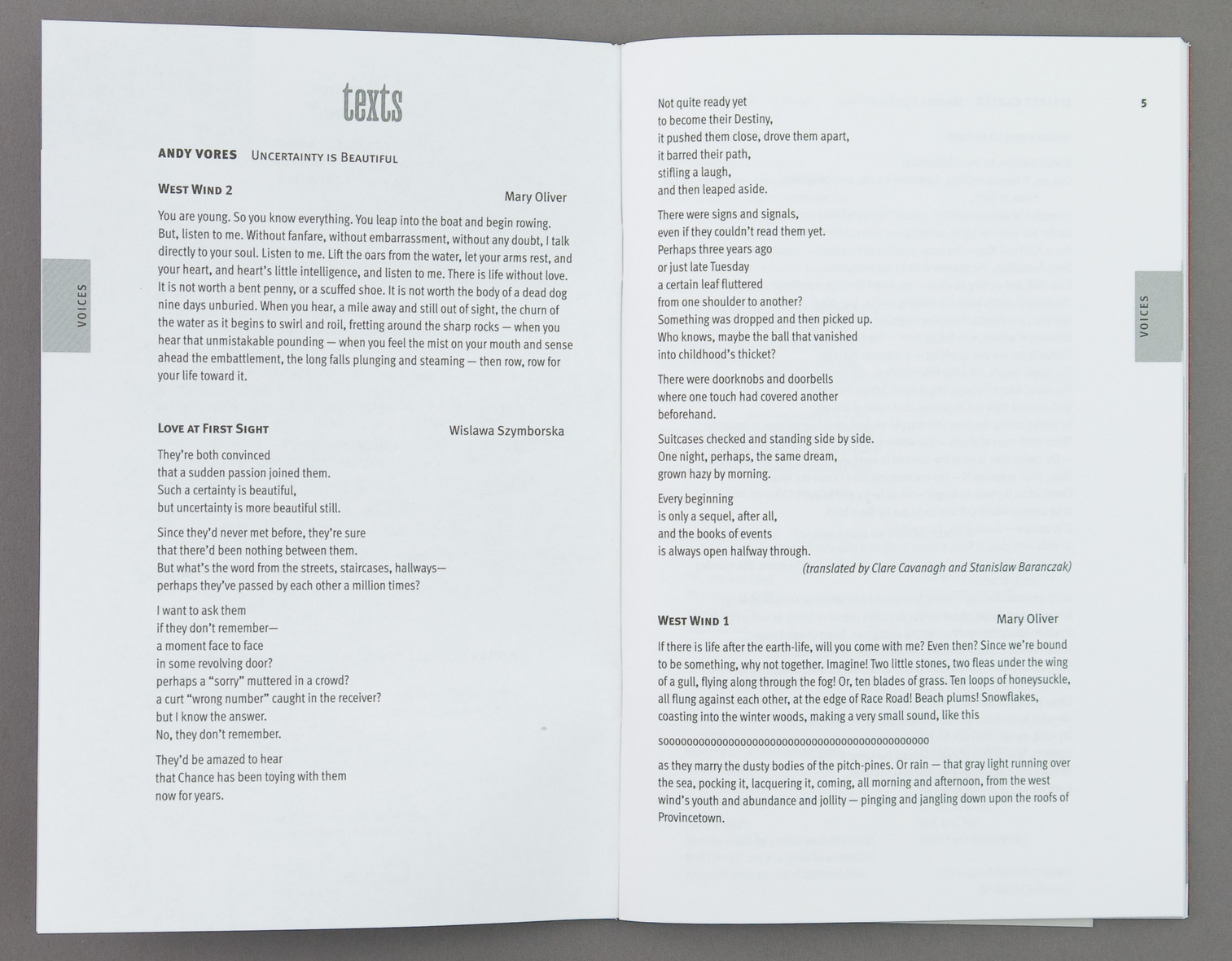
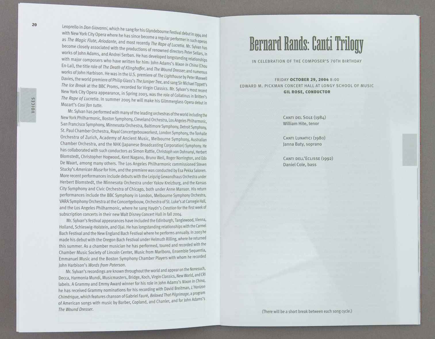
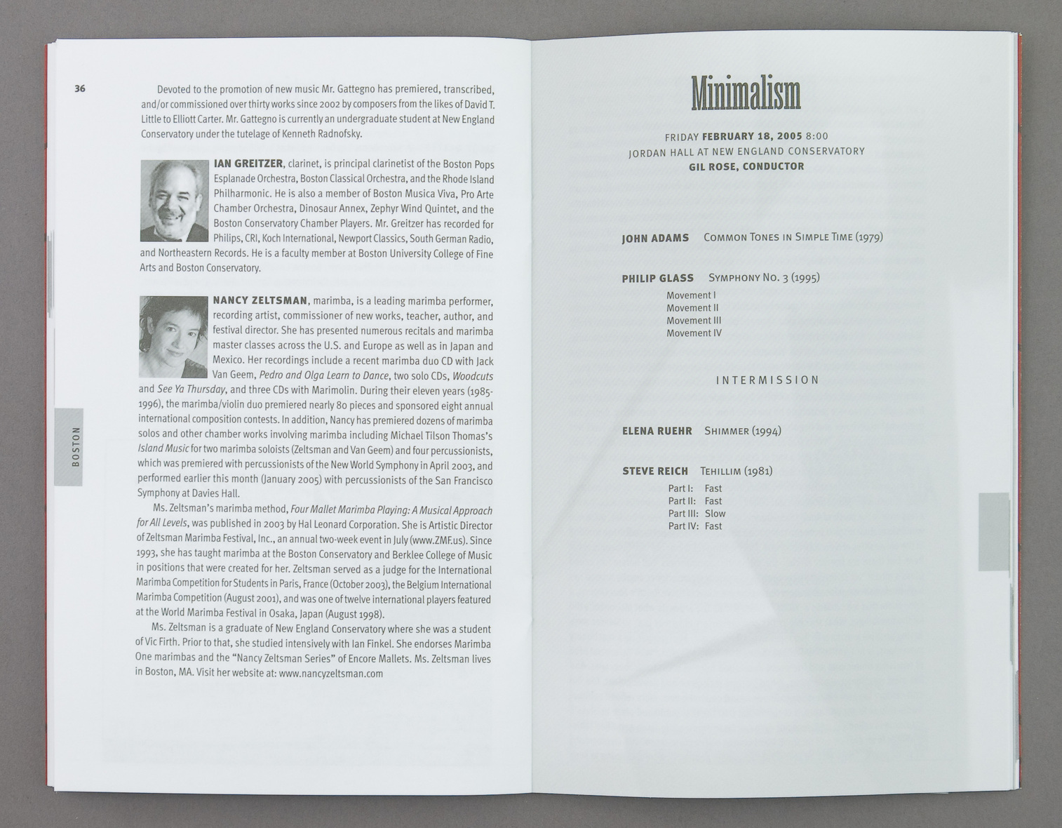
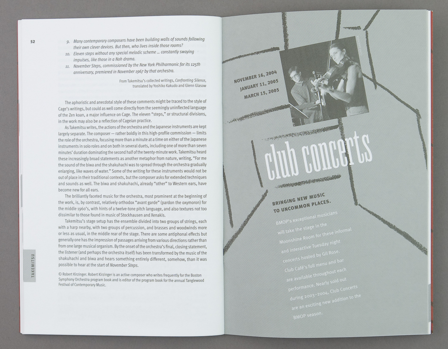
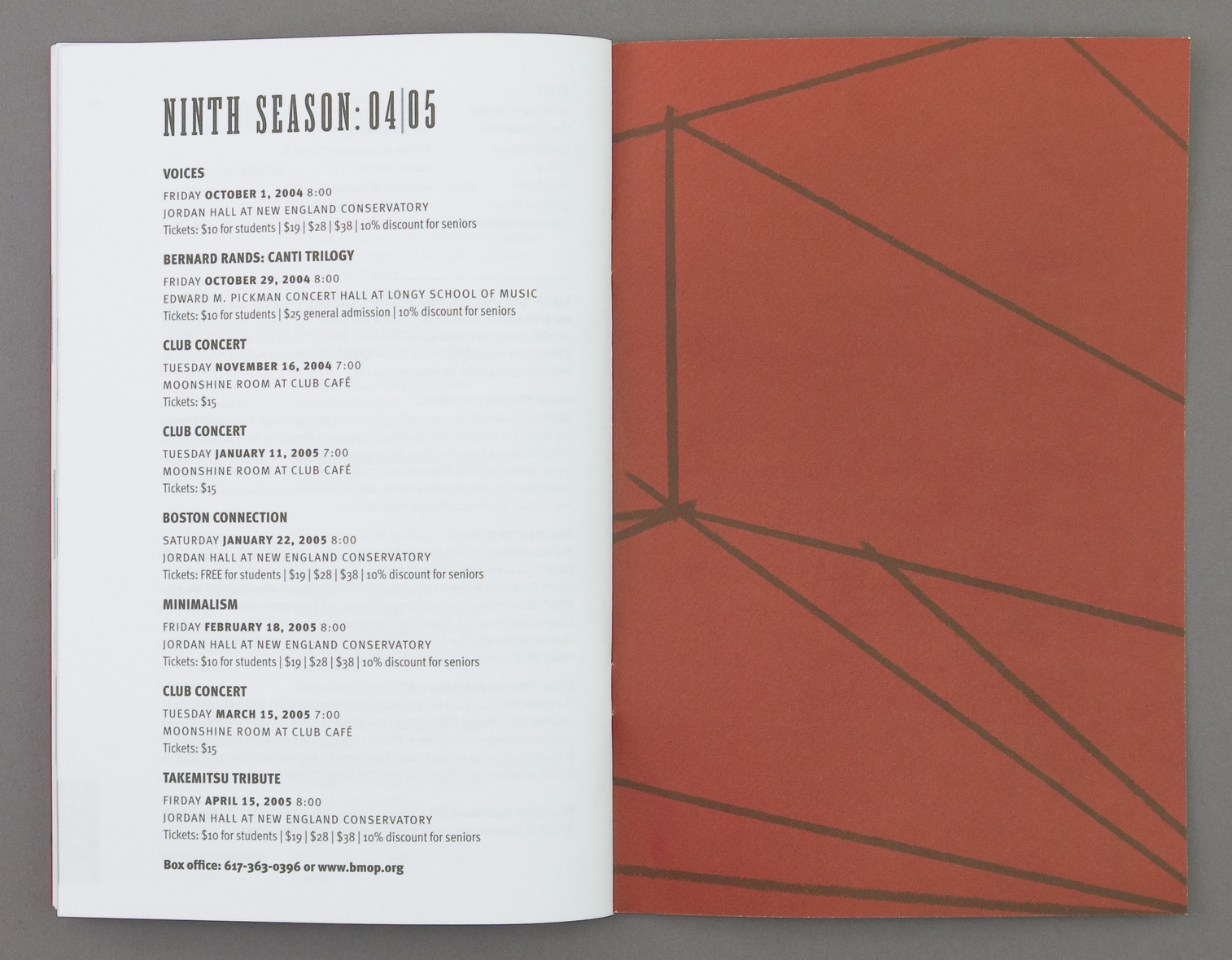
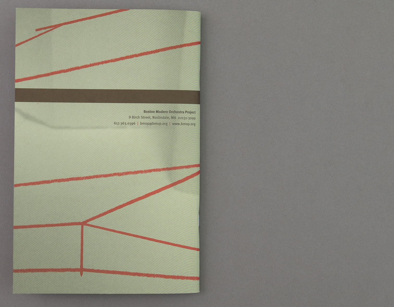
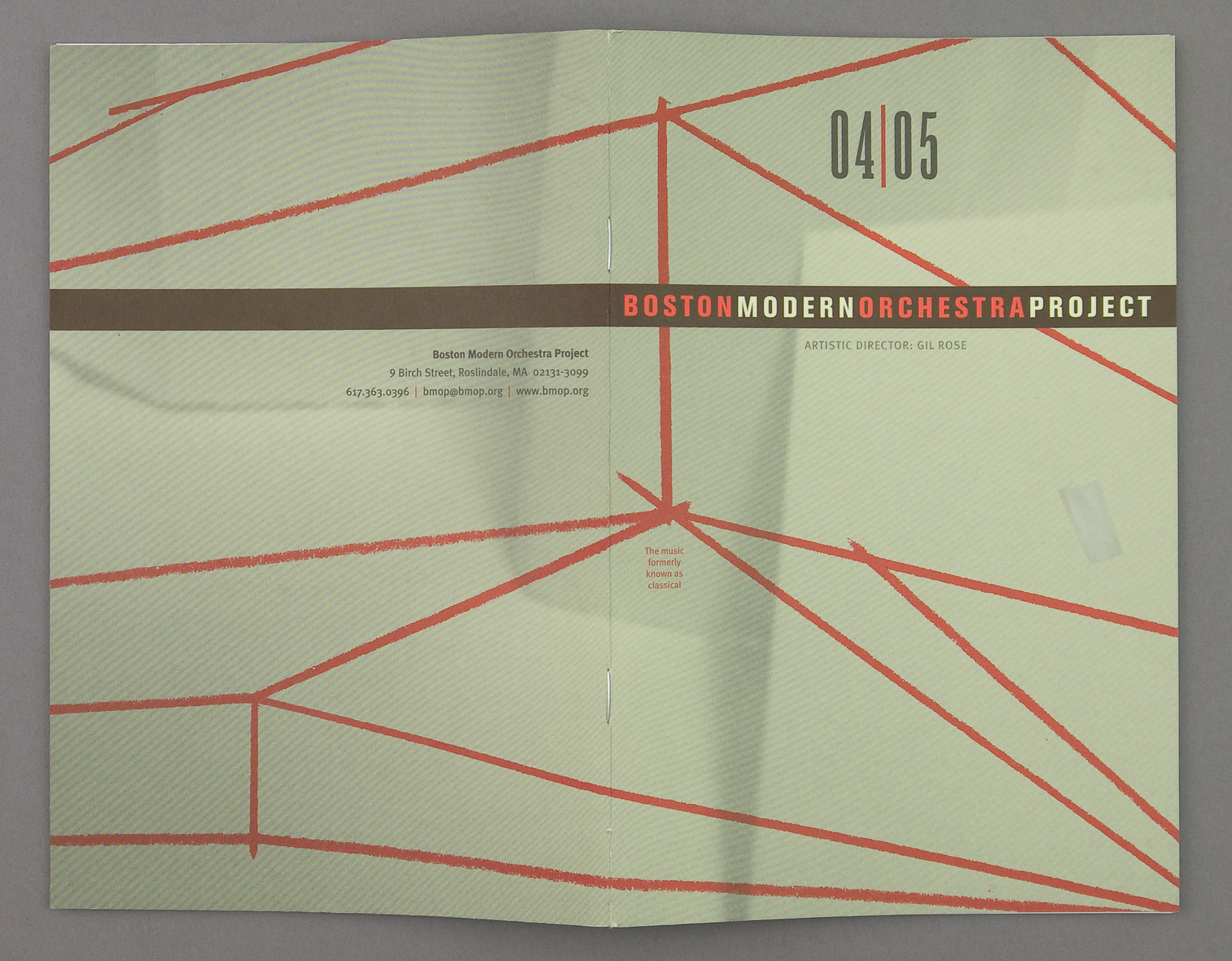
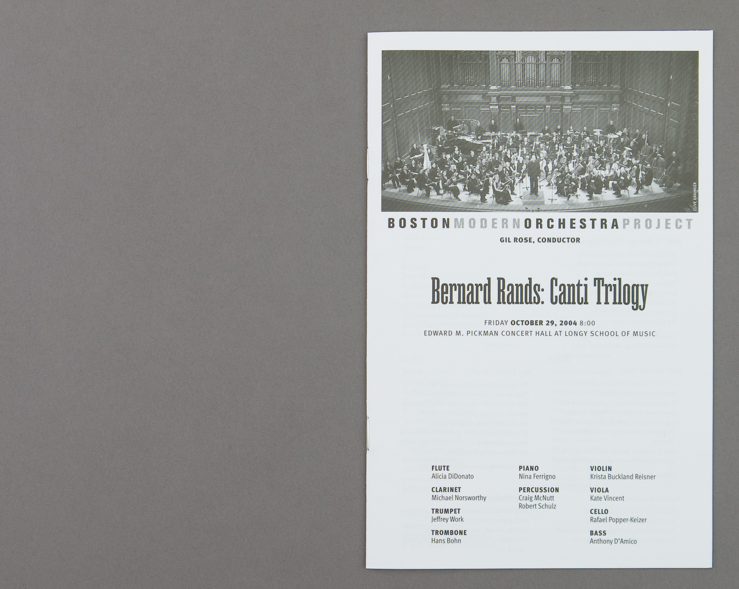
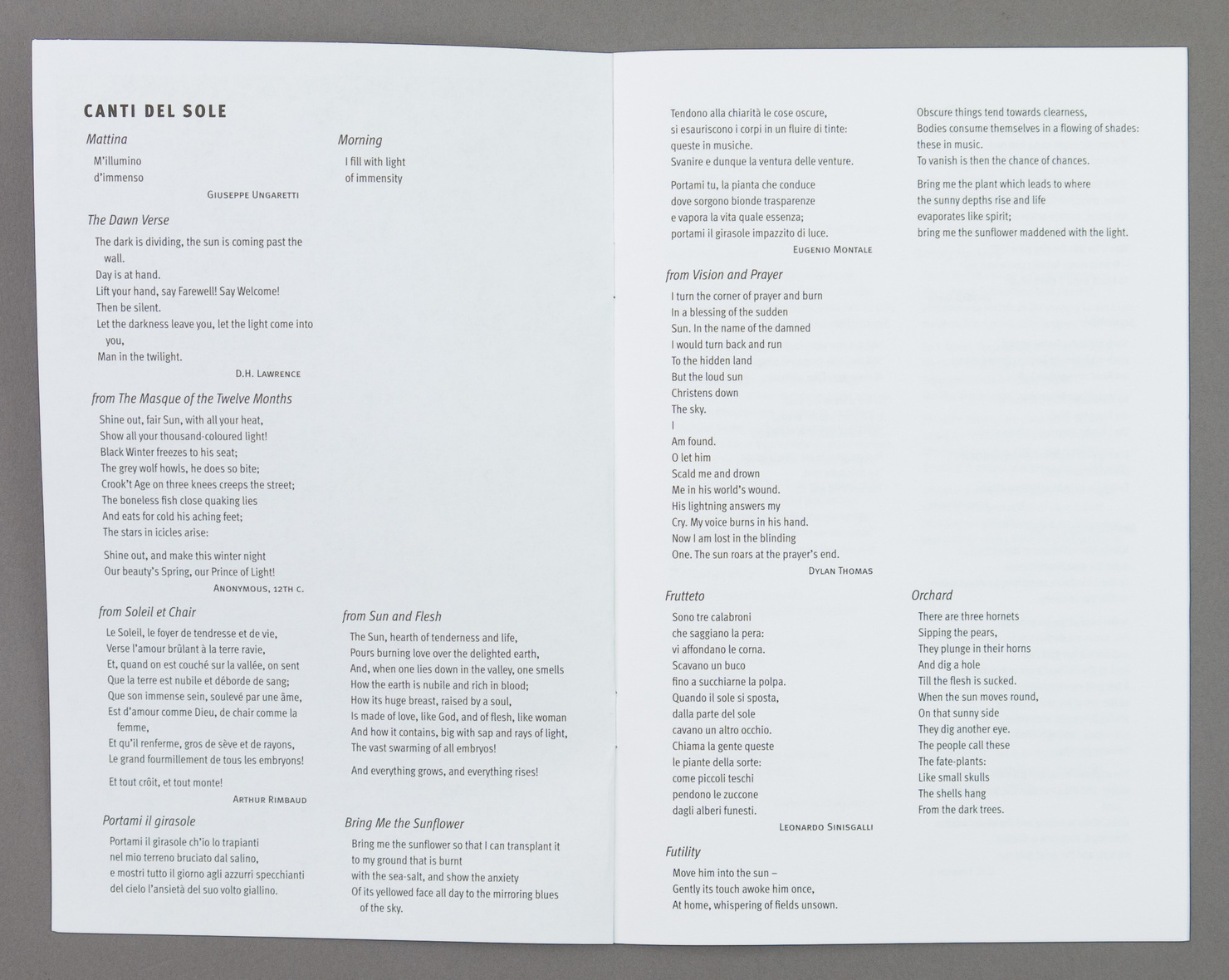
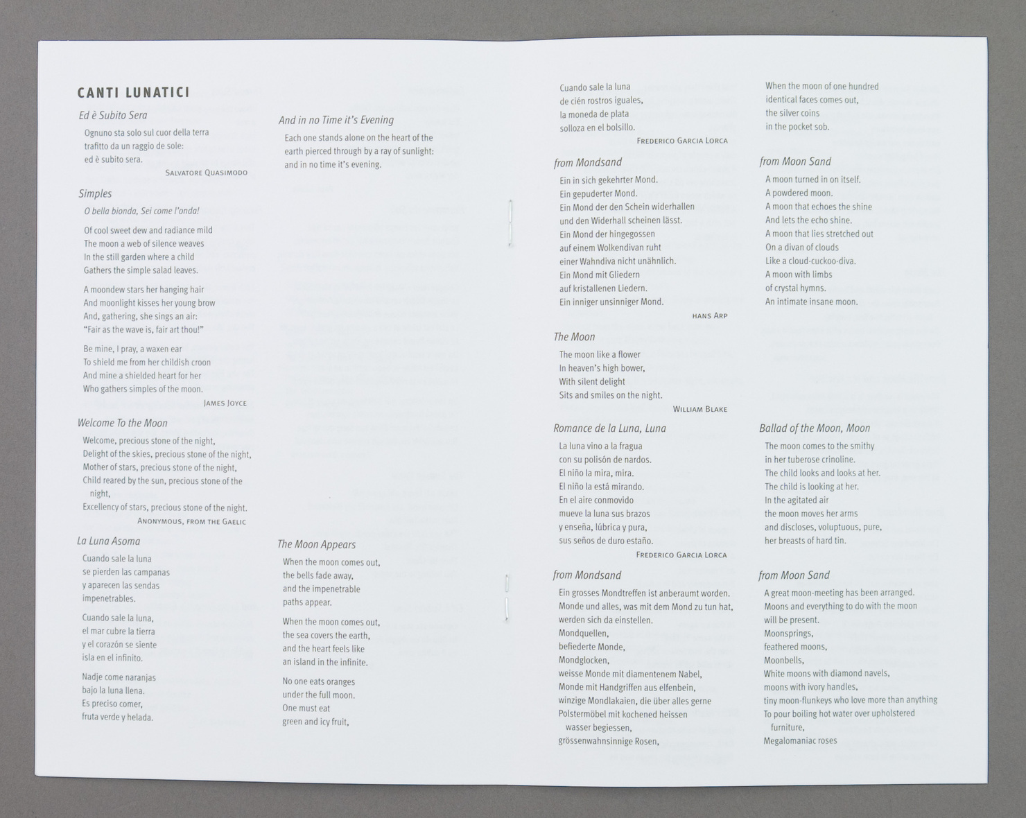
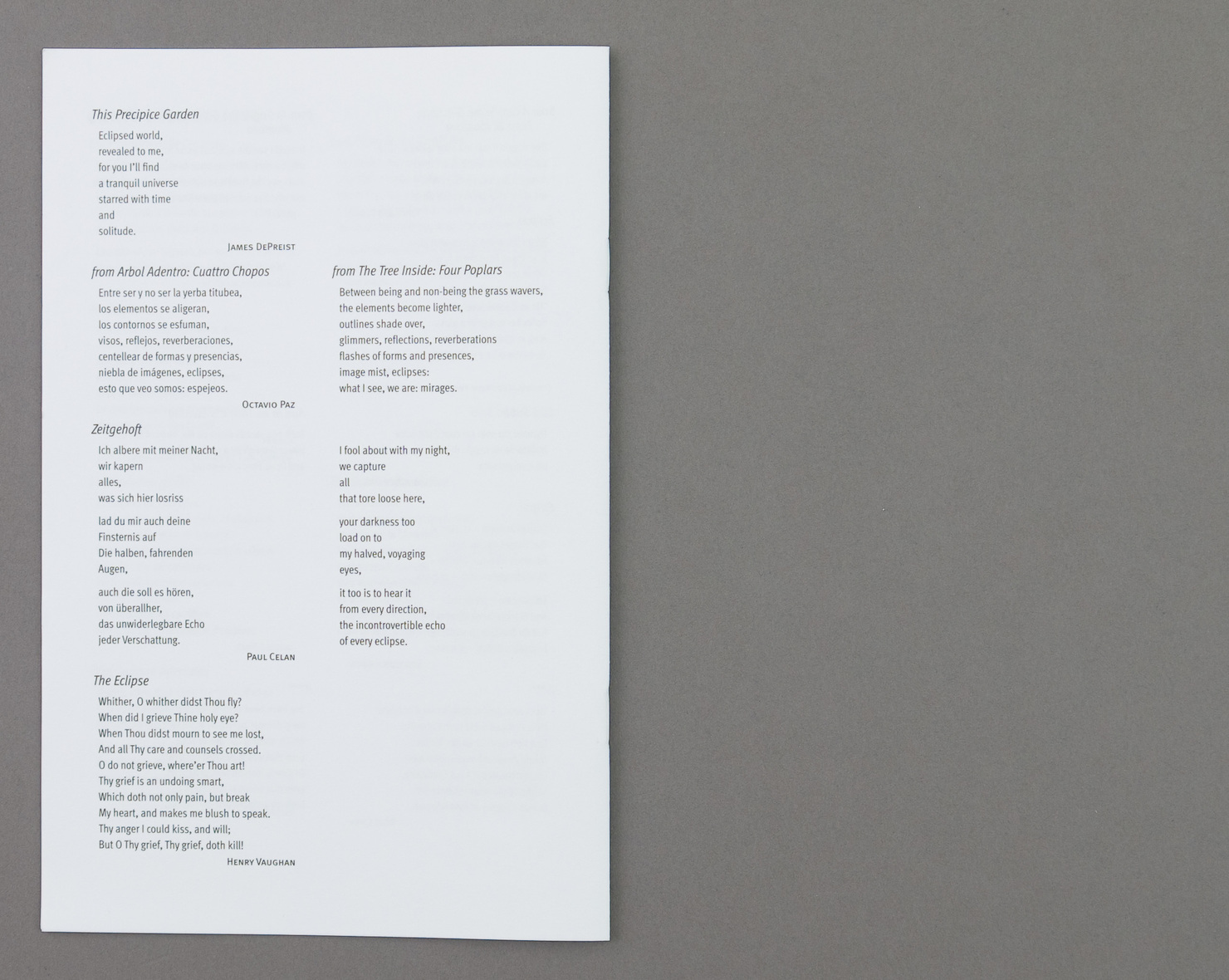
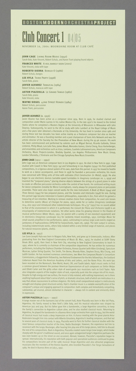
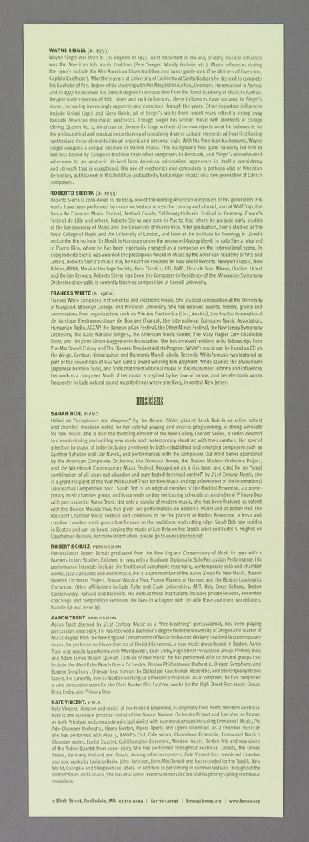
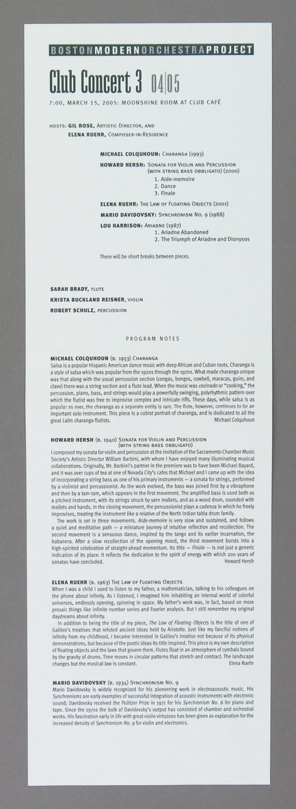
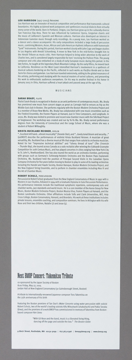
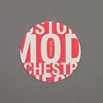
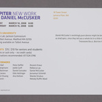
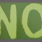
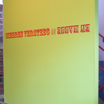
This was the second season in which separate/thematic artwork was done for each of the year's concerts. It was a combination of two different visual Modernist tropes: planes in space and geometrical architectural forms. The associations were made very, very loosely. Did Notre Dame Des Hauts really suggest "voices"? Is the Ligthning Field architecture? How "Modern" is 15th C. Japan? Or Rem Koolhaas? See research and drawings here.
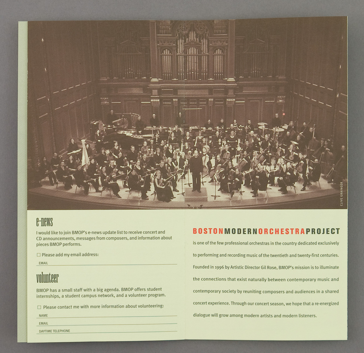
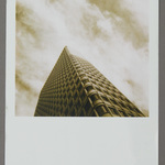
The background photographs of "planes in space" throughout the season are by Robb Ogle. As is the beautiful Central Artery Ventilation Building.
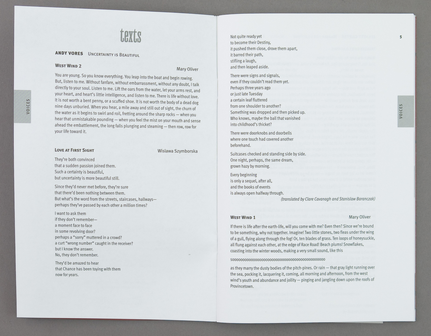
The secondary typeface this year is Antique Condensed, from Font Bureau.
JK, John Kramer September 2011
- bmop-04-0001.jpg
- bmop-04-0002.jpg
- bmop-04-0003.jpg
- bmop-04-0004.jpg
- bmop-04-0005.jpg
- bmop-04-0006.jpg
- bmop-04-0007.jpg
- bmop-04-0008.jpg
- bmop-04-0009.jpg
- bmop-04-0010.jpg
- bmop-04-0011.jpg
- bmop-04-0012.jpg
- bmop-04-0013.jpg
- bmop-04-0014.jpg
- bmop-04-0015.jpg
- bmop-04-0016.jpg
- bmop-04-0017.jpg
- bmop-04-0018.jpg
- bmop-04-0019.jpg
- bmop-04-0020.jpg
- bmop-04-0021.jpg
- bmop-04-0022.jpg
- bmop-04-0023.jpg
- bmop-04-0024.jpg
- bmop-04-0025.jpg
- bmop-04-0026.jpg
- bmop-04-0027.jpg
- bmop-04-0028.jpg
- bmop-04-0029.jpg
- bmop-04-0030.jpg
- bmop-04-0031.jpg
- bmop-04-0032.jpg
- bmop-04-0033.jpg
- bmop-04-0034.jpg
- bmop-04-0035.jpg
- bmop-04-0036.jpg
- bmop-04-0037.jpg
- bmop-04-0038.jpg
- bmop-04-0039.jpg
- bmop-04-0040.jpg
- bmop-04-0041.jpg
- bmop-04-0042.jpg
- bmop-04-0043.jpg
- bmop-04-0044.jpg
- bmop-04-0045.jpg
- bmop-04-0046.jpg
- bmop-04-0047.jpg