
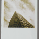













Main Gallery "Made in Poland: Contemporary Pinhole Photography"
Use keyboard arrows (← and →) or click image to advance.


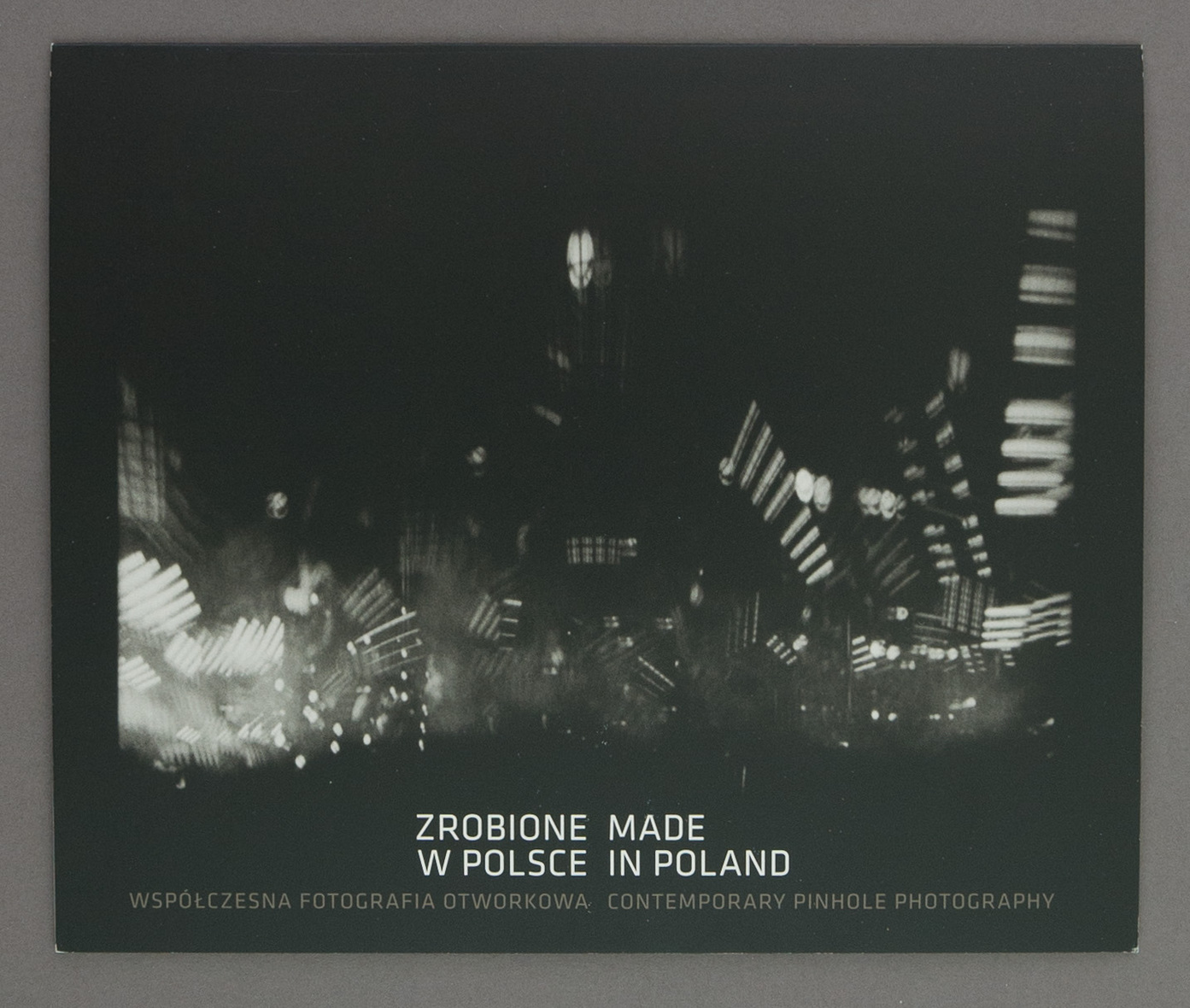
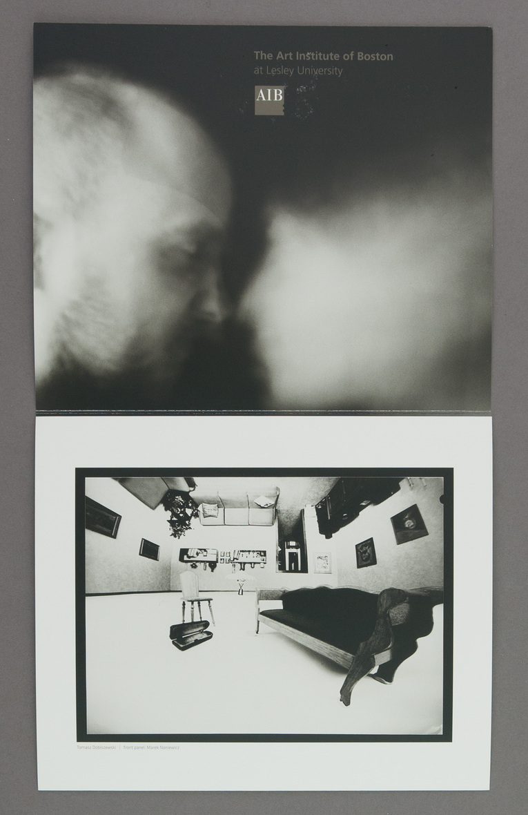
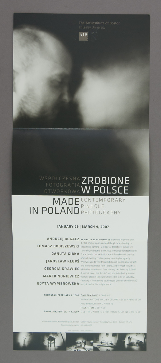
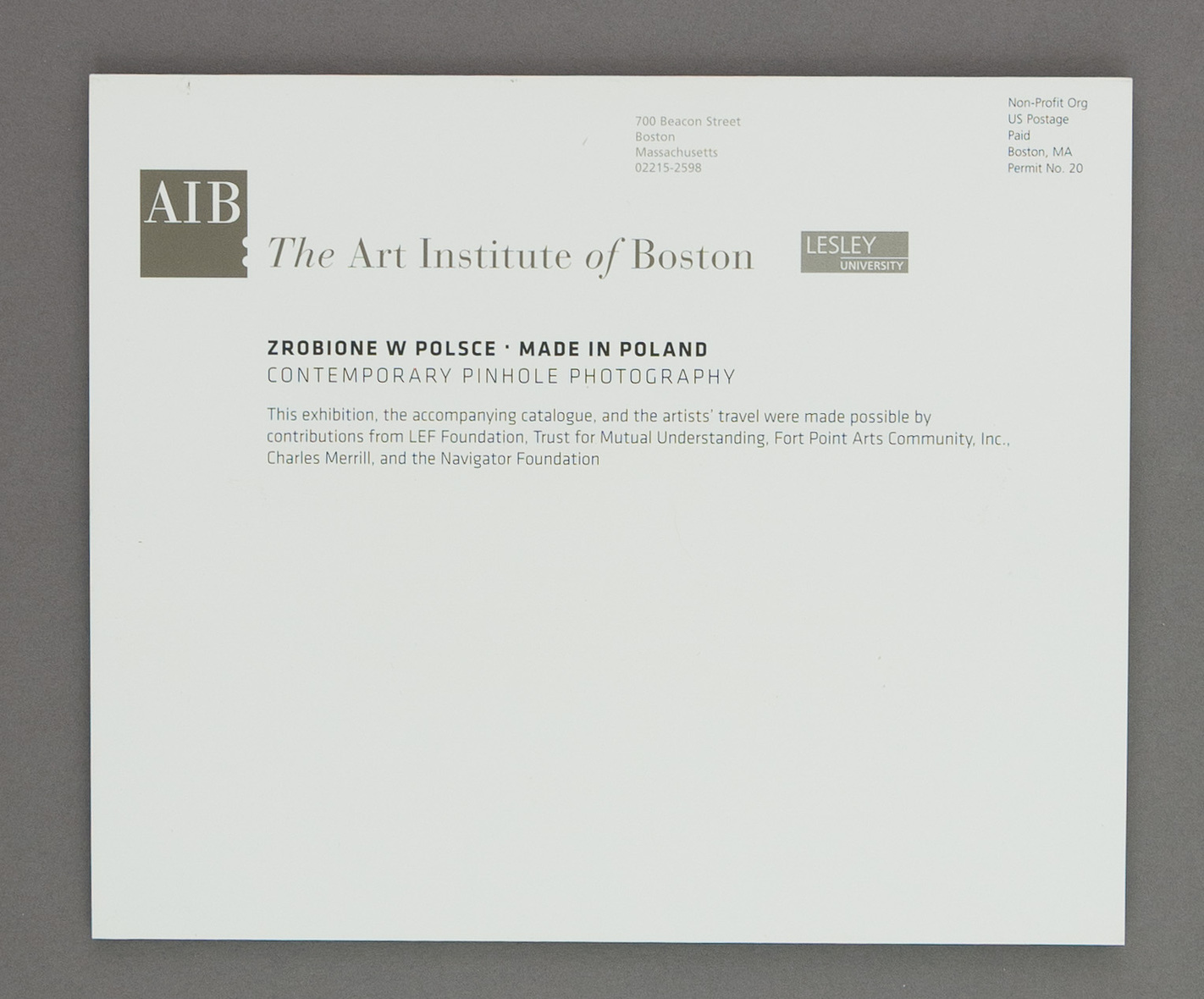
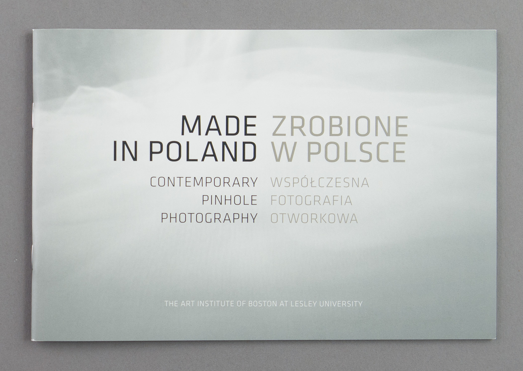
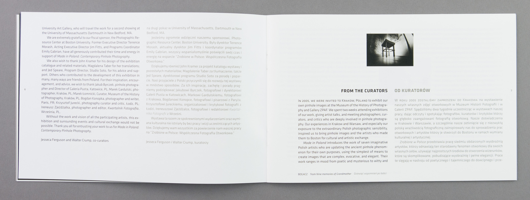
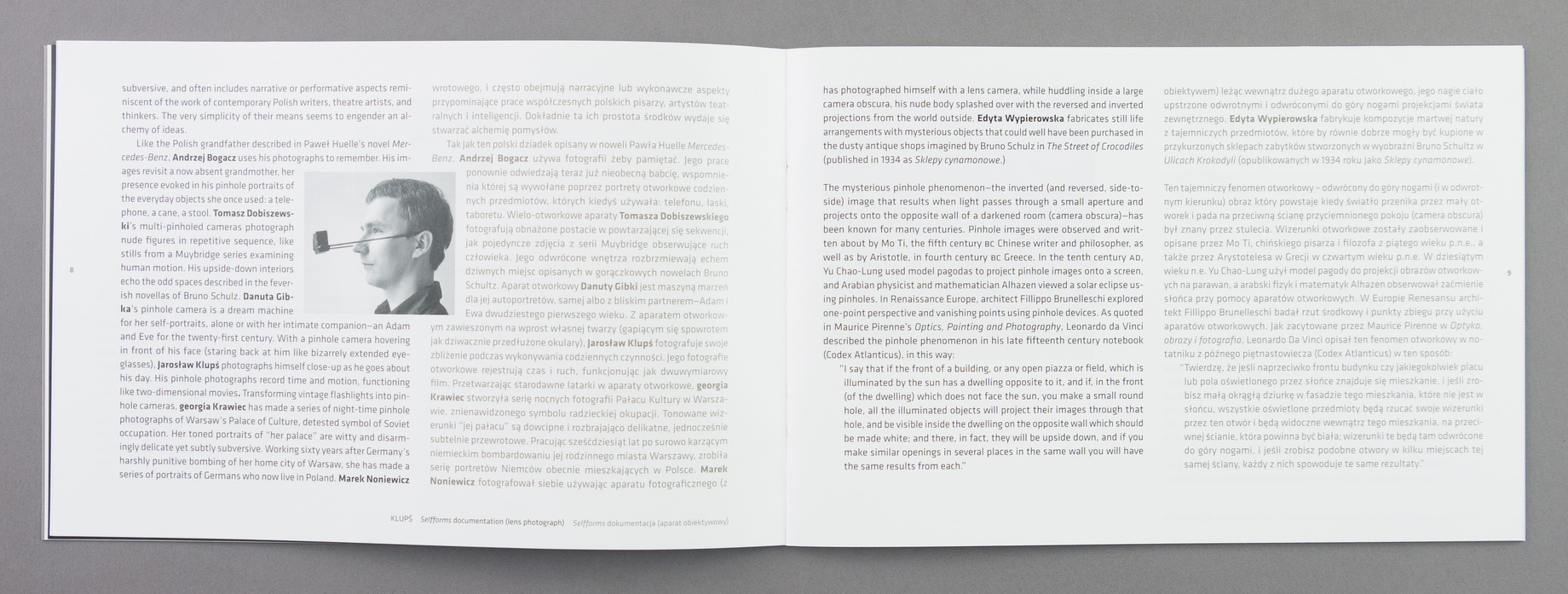
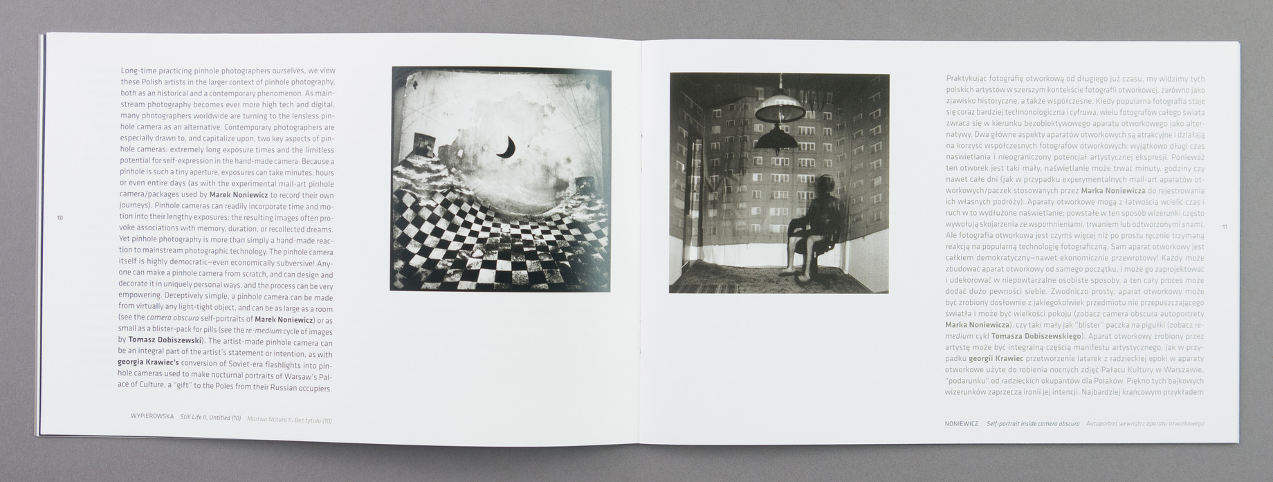
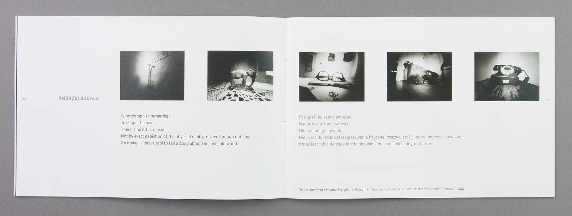
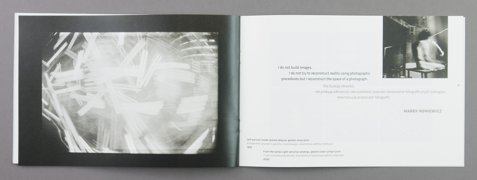
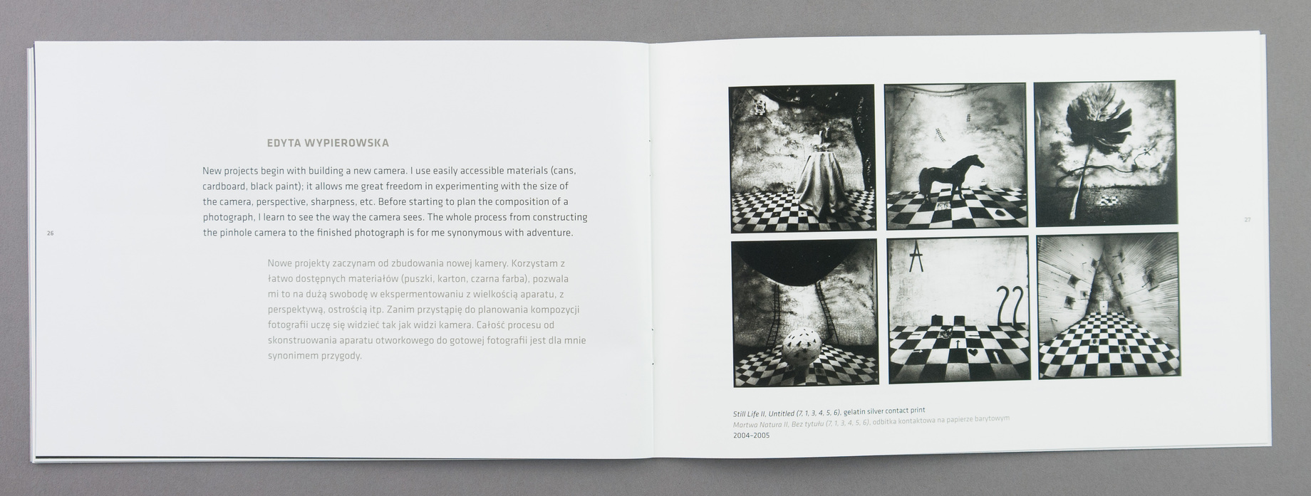
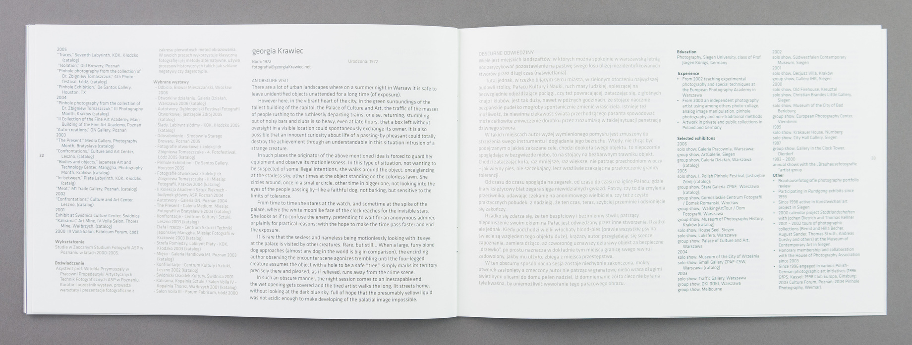
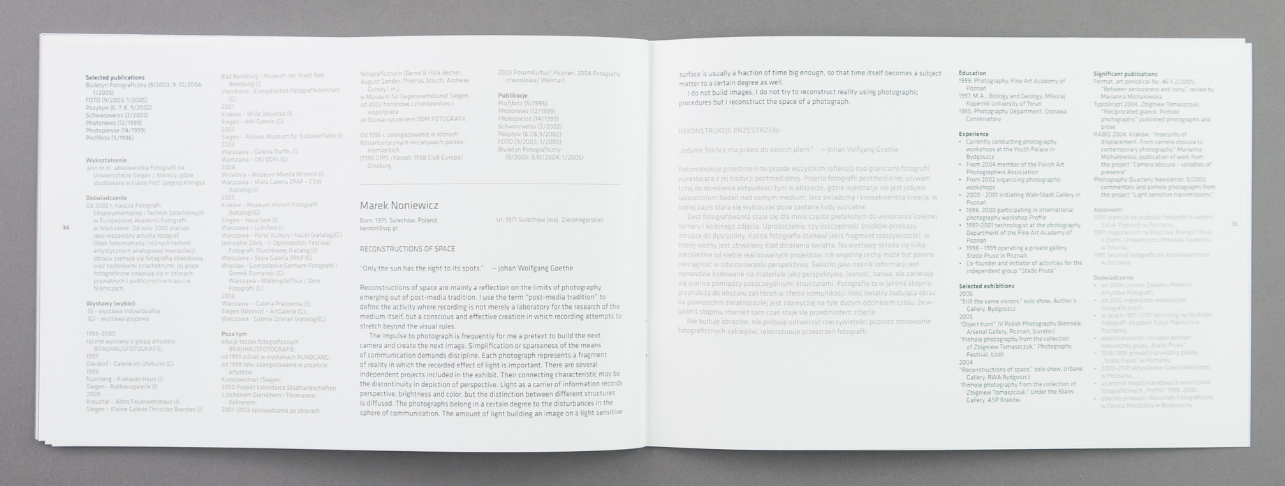
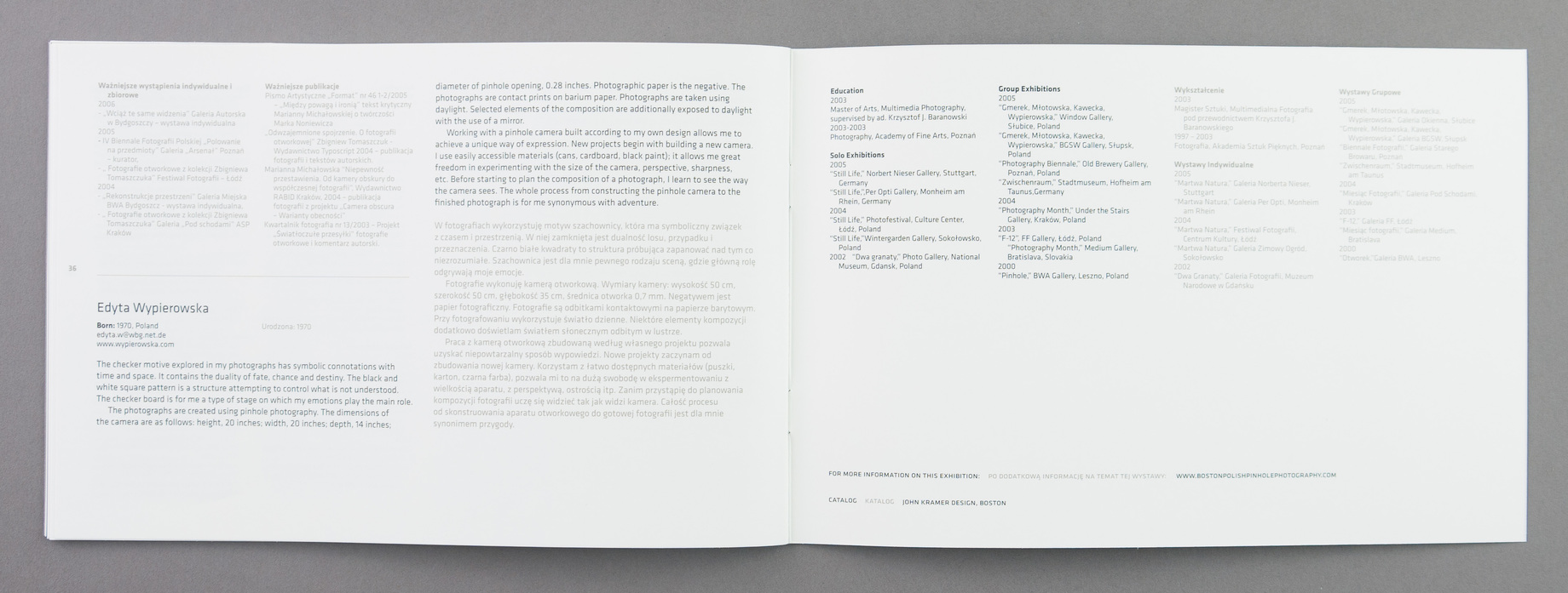
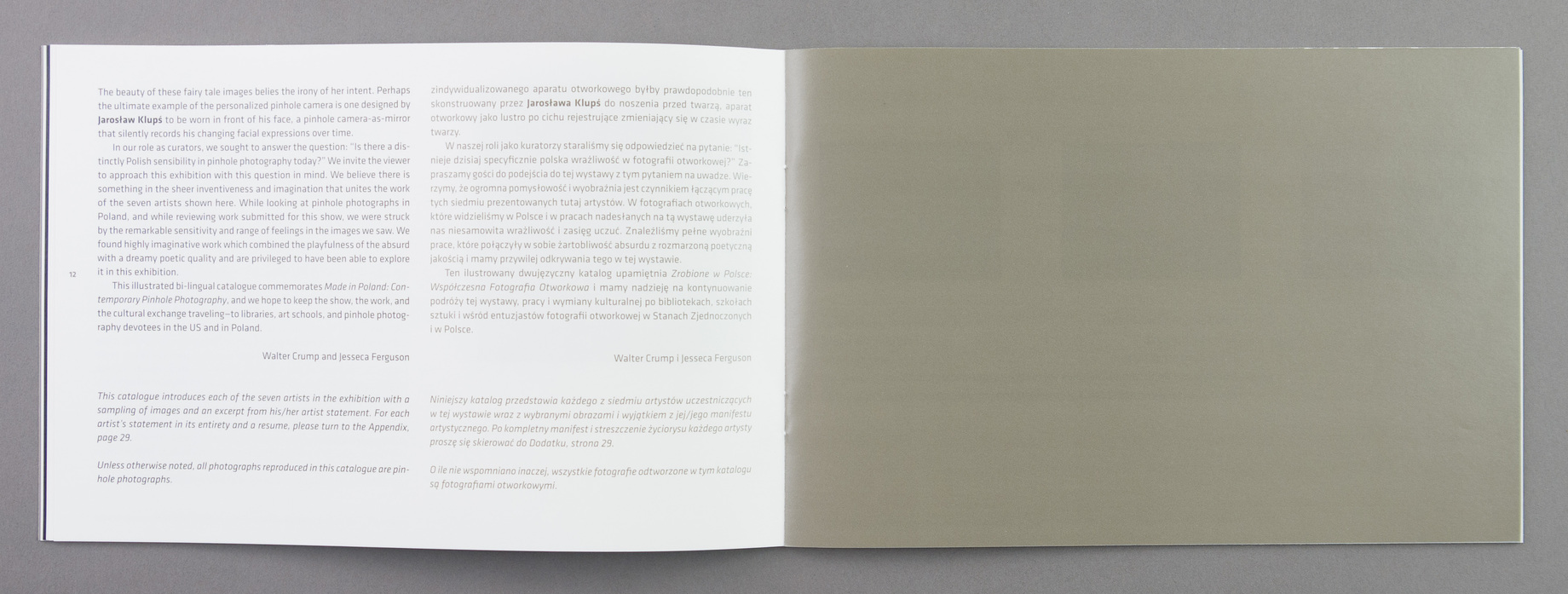
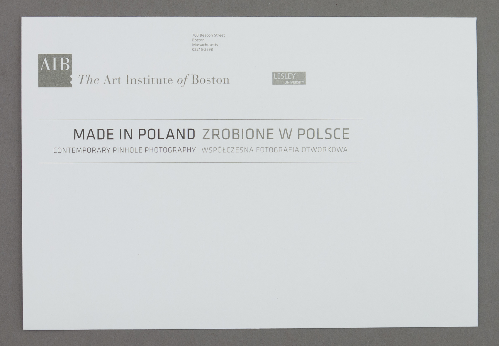
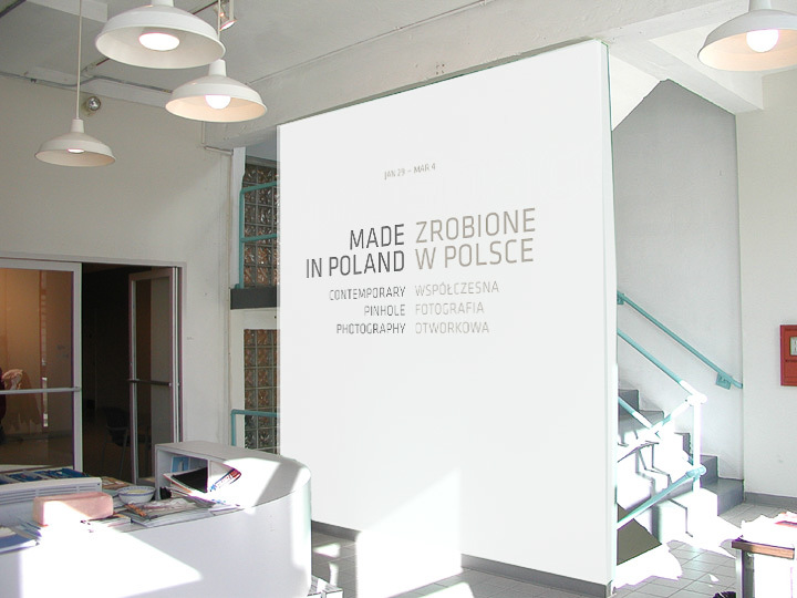
Loved working on this show. All thanks to Jesseca Ferguson for curating it and allowing me to participate. Besides having great work to use, the poster and booklet were to be bilingual, so I needed an opentype font that would give me eastern european characters. I'd used Klavika on a cookbook (not of my own design). It was the first complete opentype font I'd ever spent any time with. It was visually perfect for this work, and extremely flexible. Small caps didn't hurt either. (Postscript: I was deeply chagrined to realize too late how ubiquitous it was: all display type in the Boston Phoenix and The Boston Globe Magazine, as well as being the source for the Facebook logotype.)
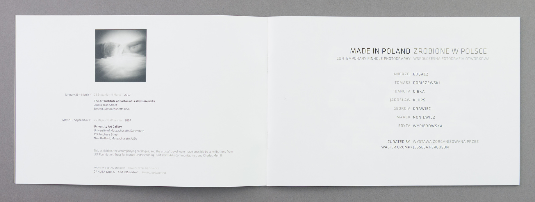
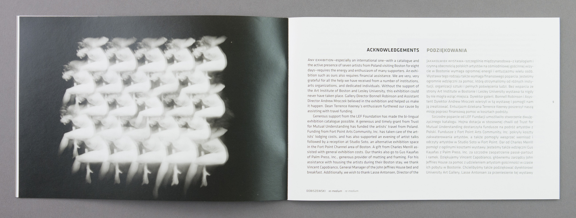
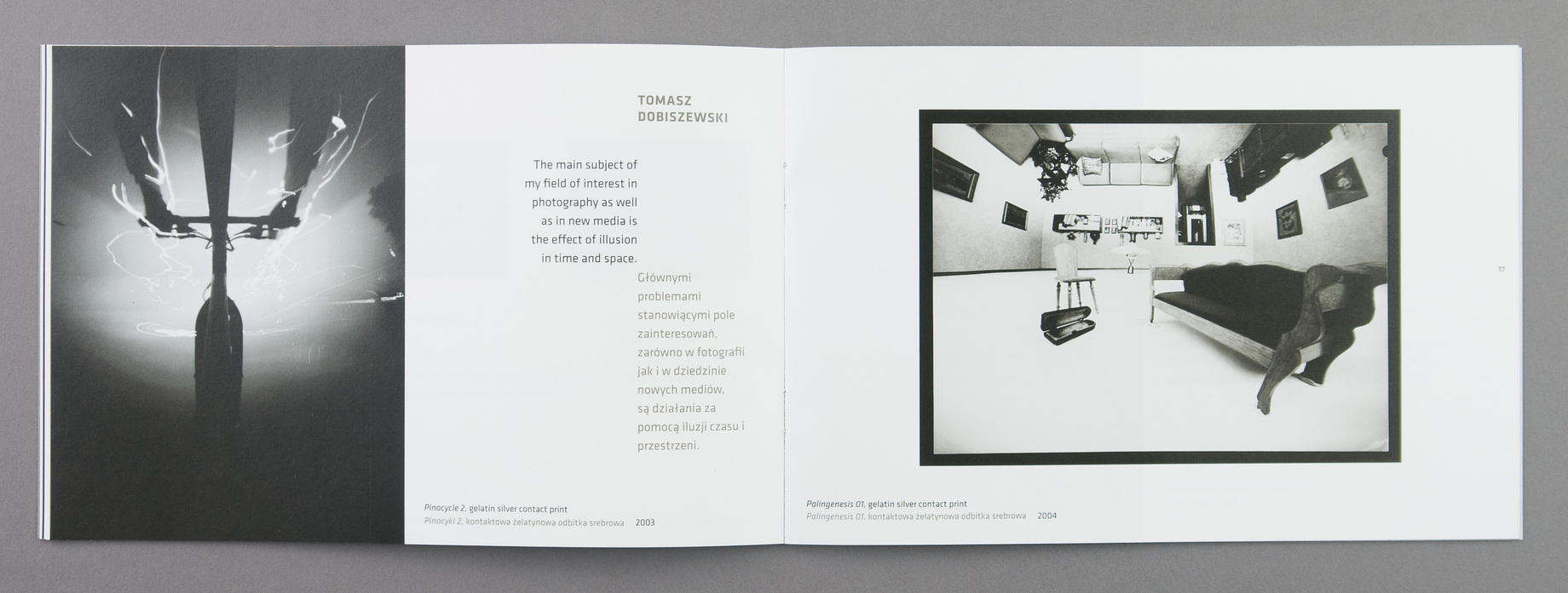
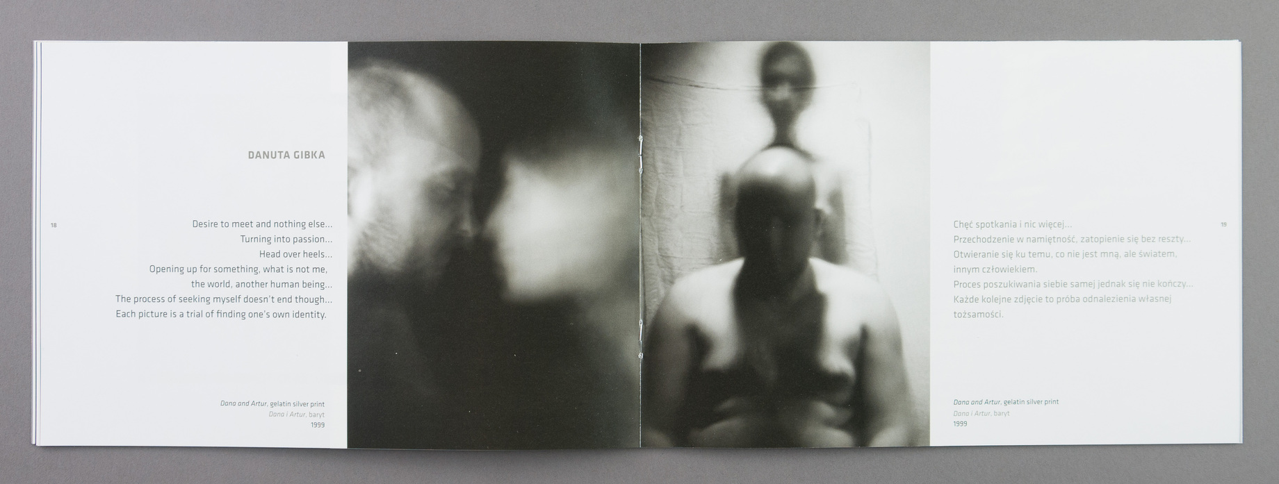
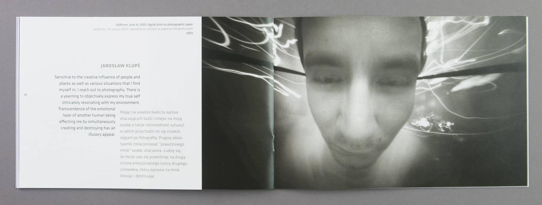
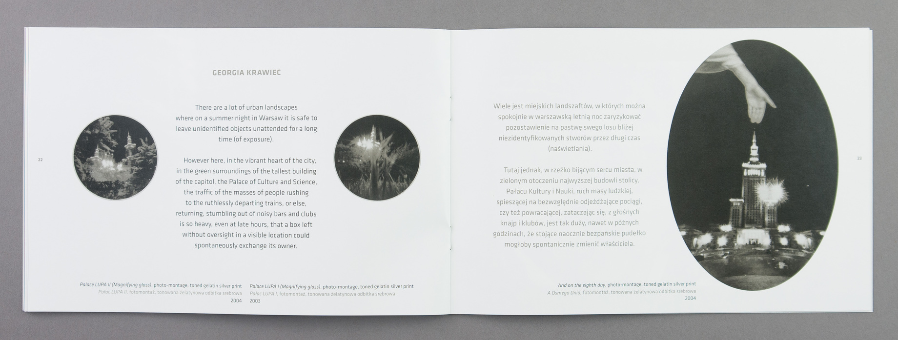
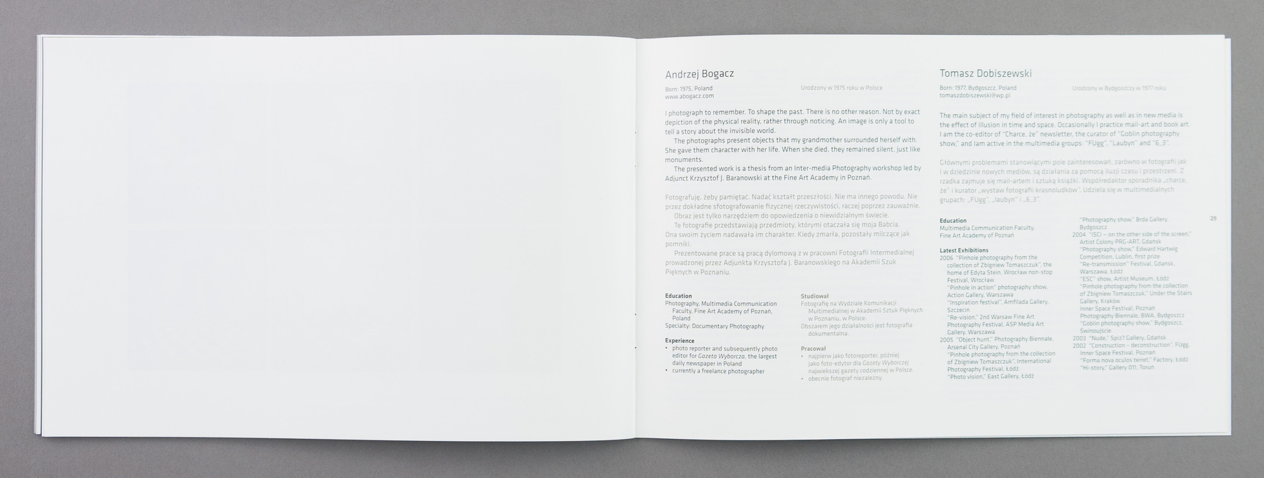
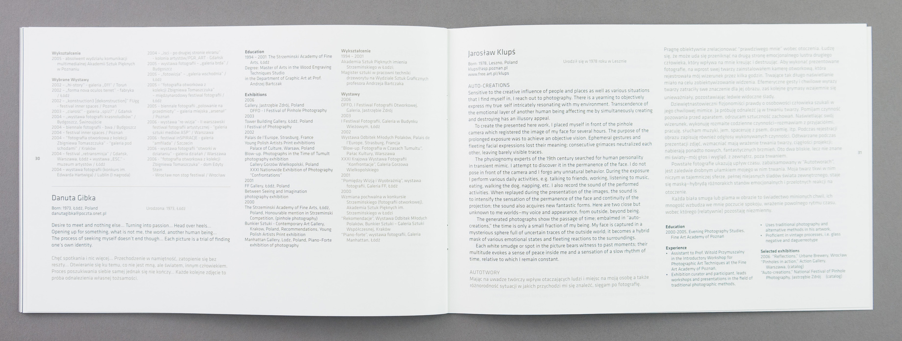
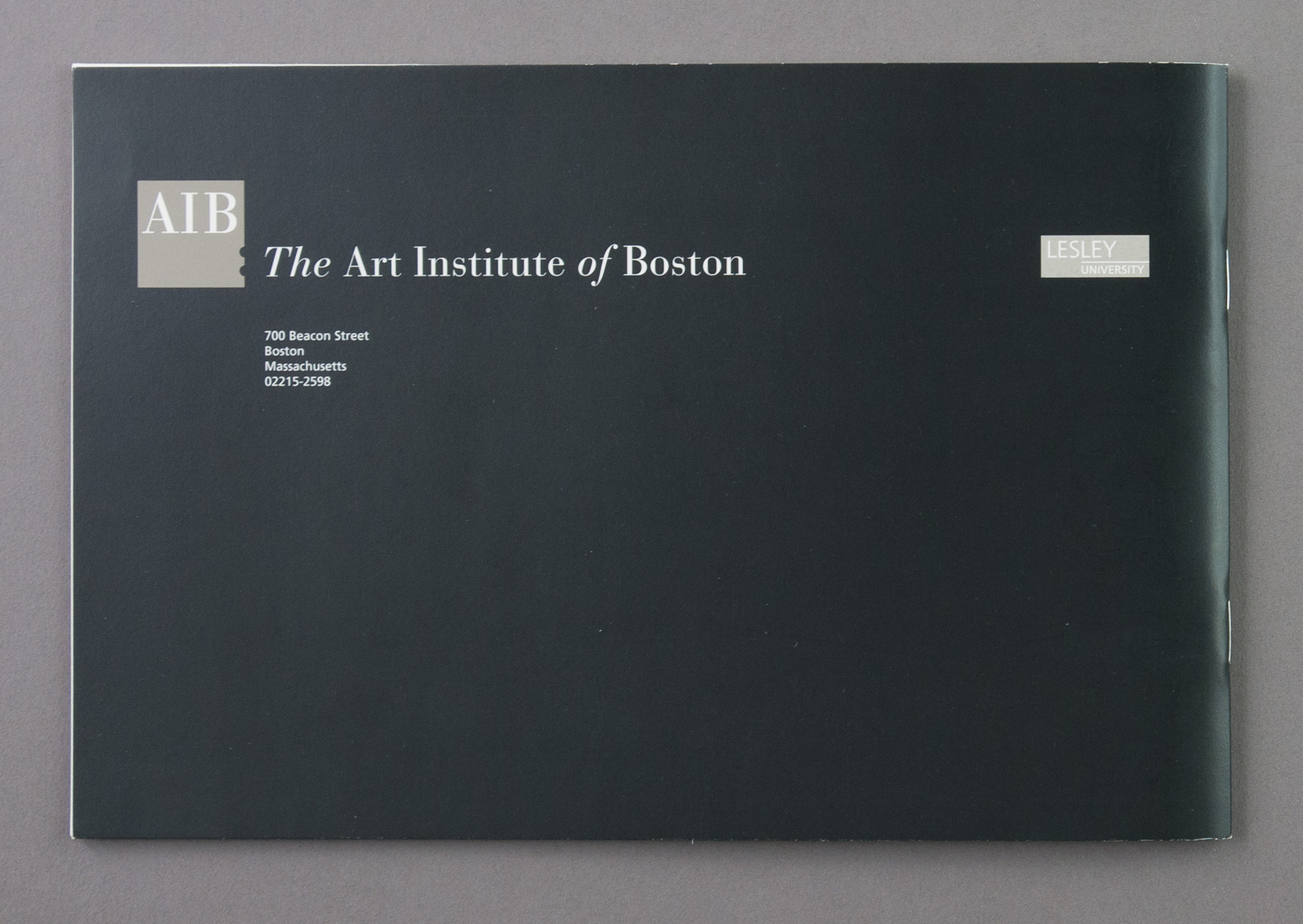
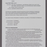
The booklet is yet another example of letting the artwork determine the grid to a great extent. If there is a design concept, it is the central axis which grew out of the need for English/Polish. But the central gutter between the two columns for the essays and backmatter is moved left or right as needed to keep the columns even. Most of the artists came over for the opening and were exceedingly gracious and fascinating to talk to.
JK January 2013
- aib-polish-pin-0001.jpg
- aib-polish-pin-0002.jpg
- aib-polish-pin-0003.jpg
- aib-polish-pin-0004.jpg
- aib-polish-pin-0005.jpg
- aib-polish-pin-0006.jpg
- aib-polish-pin-0007.jpg
- aib-polish-pin-0008.jpg
- aib-polish-pin-0009.jpg
- aib-polish-pin-0010.jpg
- aib-polish-pin-0011.jpg
- aib-polish-pin-0012.jpg
- aib-polish-pin-0013.jpg
- aib-polish-pin-0014.jpg
- aib-polish-pin-0015.jpg
- aib-polish-pin-0016.jpg
- aib-polish-pin-0017.jpg
- aib-polish-pin-0018.jpg
- aib-polish-pin-0019.jpg
- aib-polish-pin-0020.jpg
- aib-polish-pin-0021.jpg
- aib-polish-pin-0022.jpg
- aib-polish-pin-0023.jpg
- aib-polish-pin-0024.jpg
- aib-polish-pin-0025.jpg
- aib-polish-pin-0026.jpg
- aib-polish-pin-0027.jpg