













Back Bay Chorale: 2005–2006 Season
Use keyboard arrows (← and →) or click image to advance.


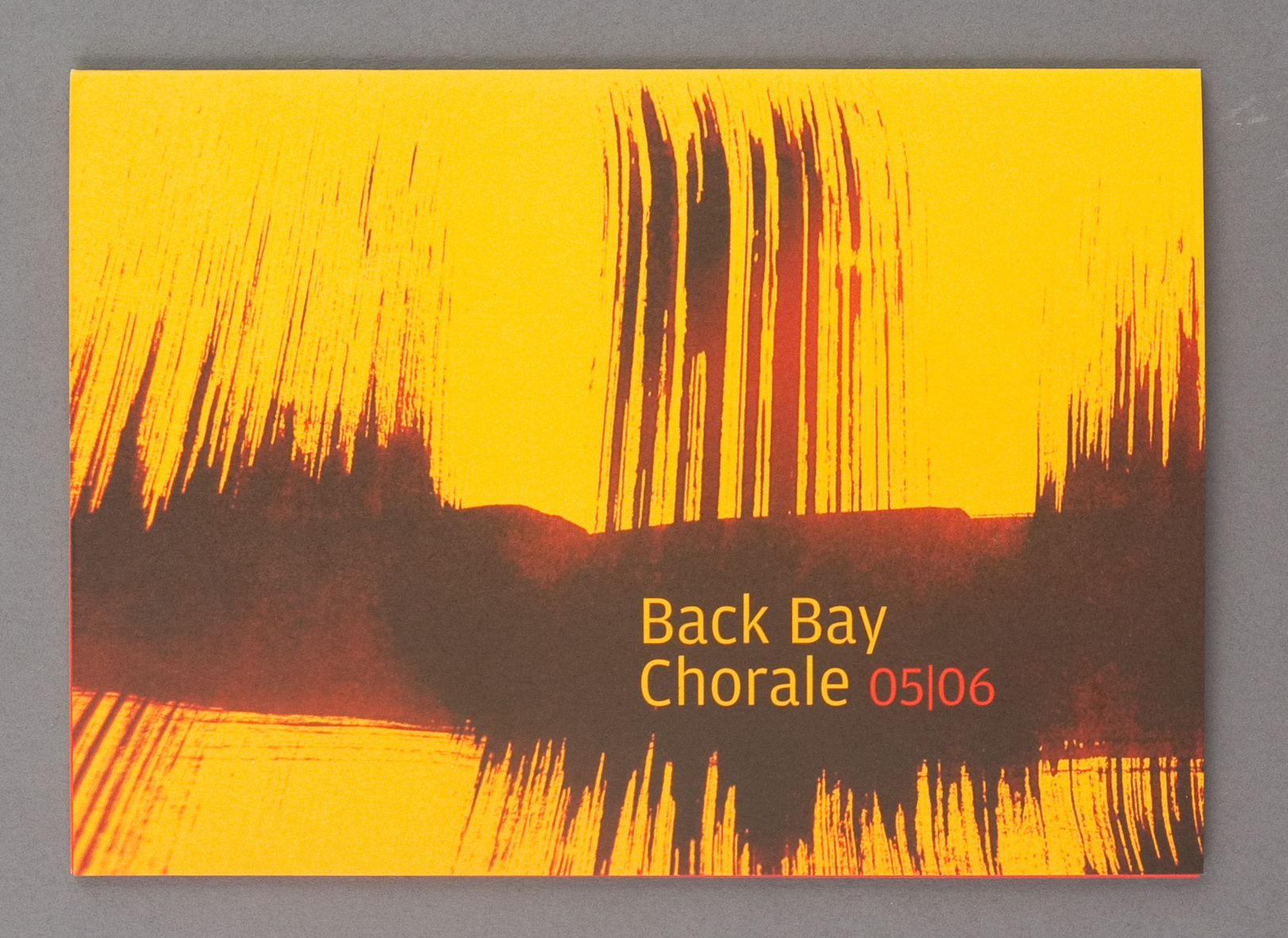
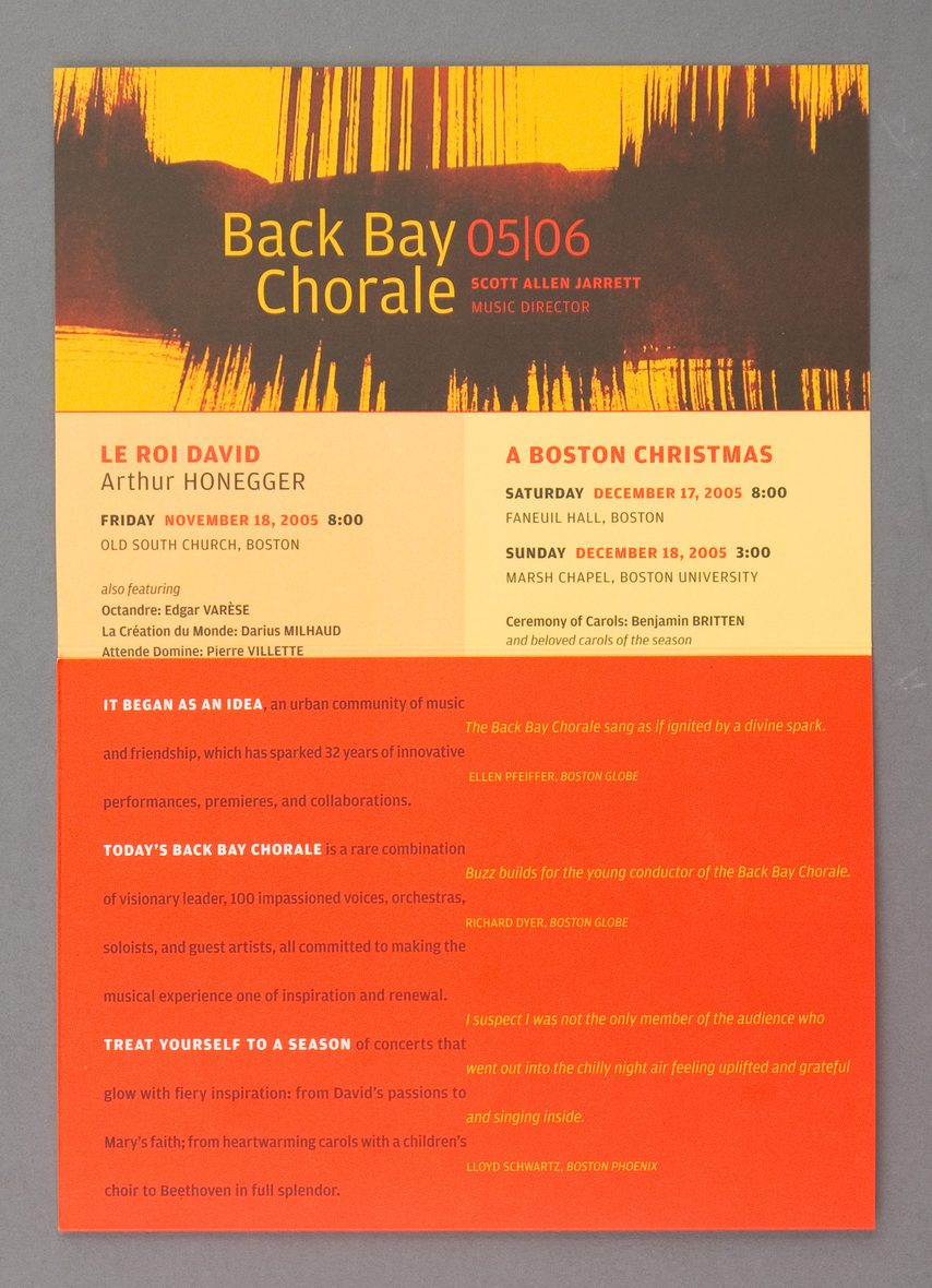
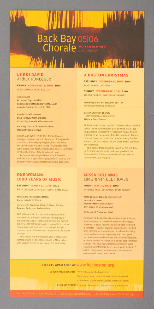
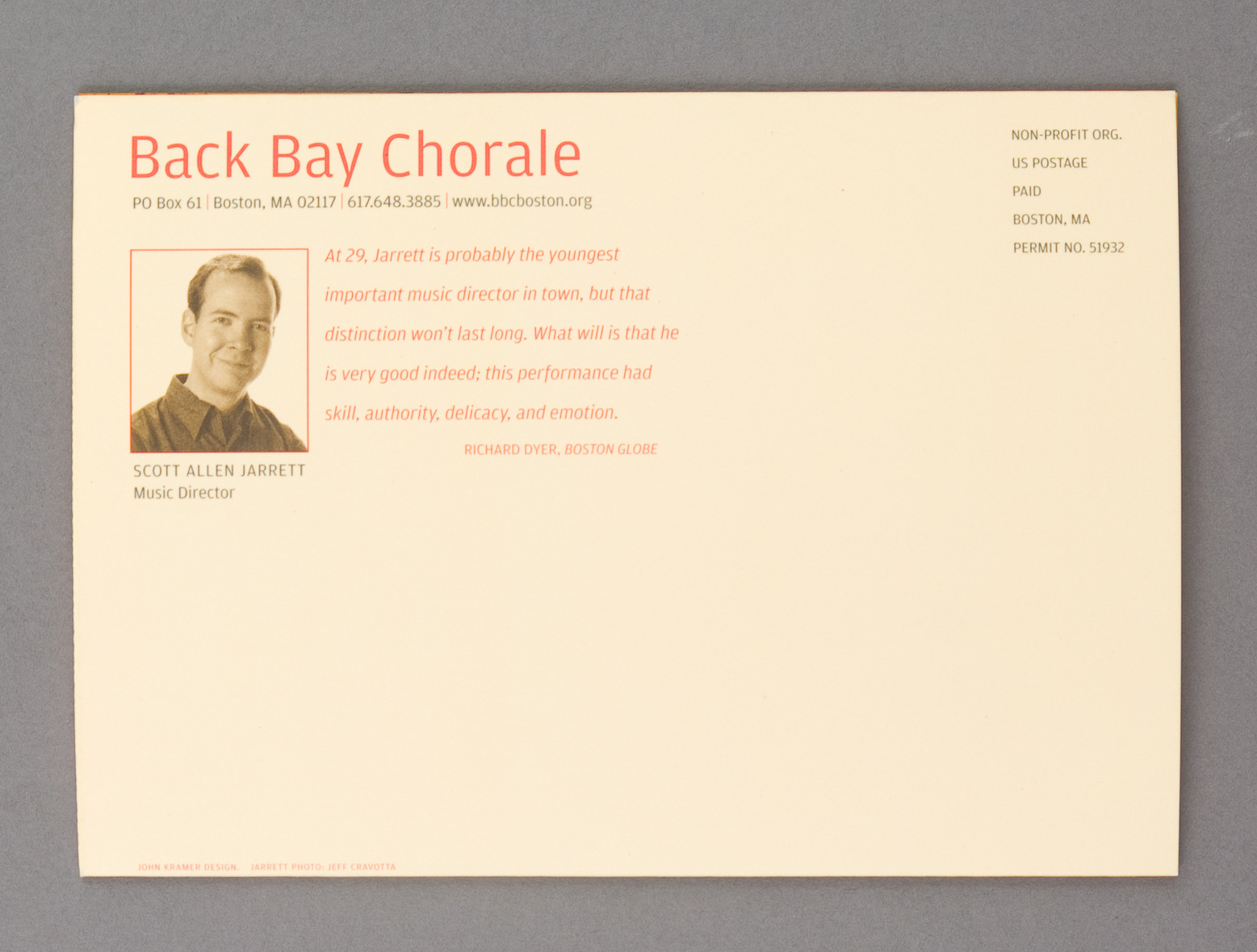
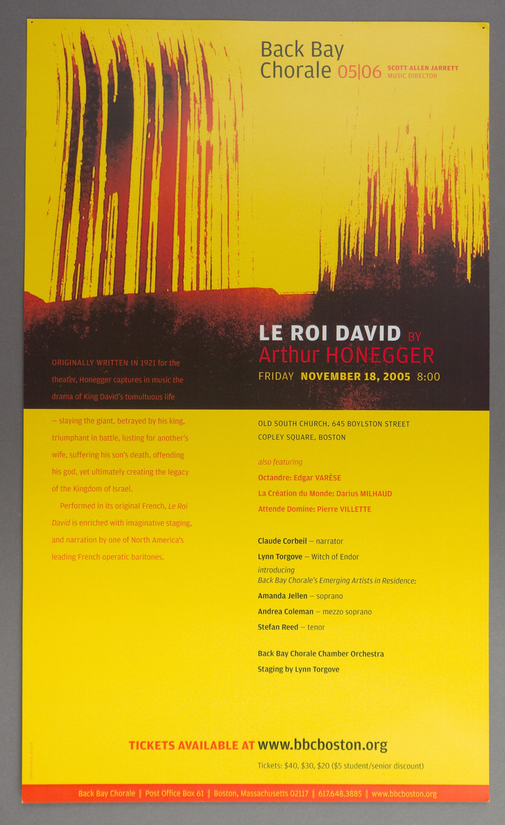
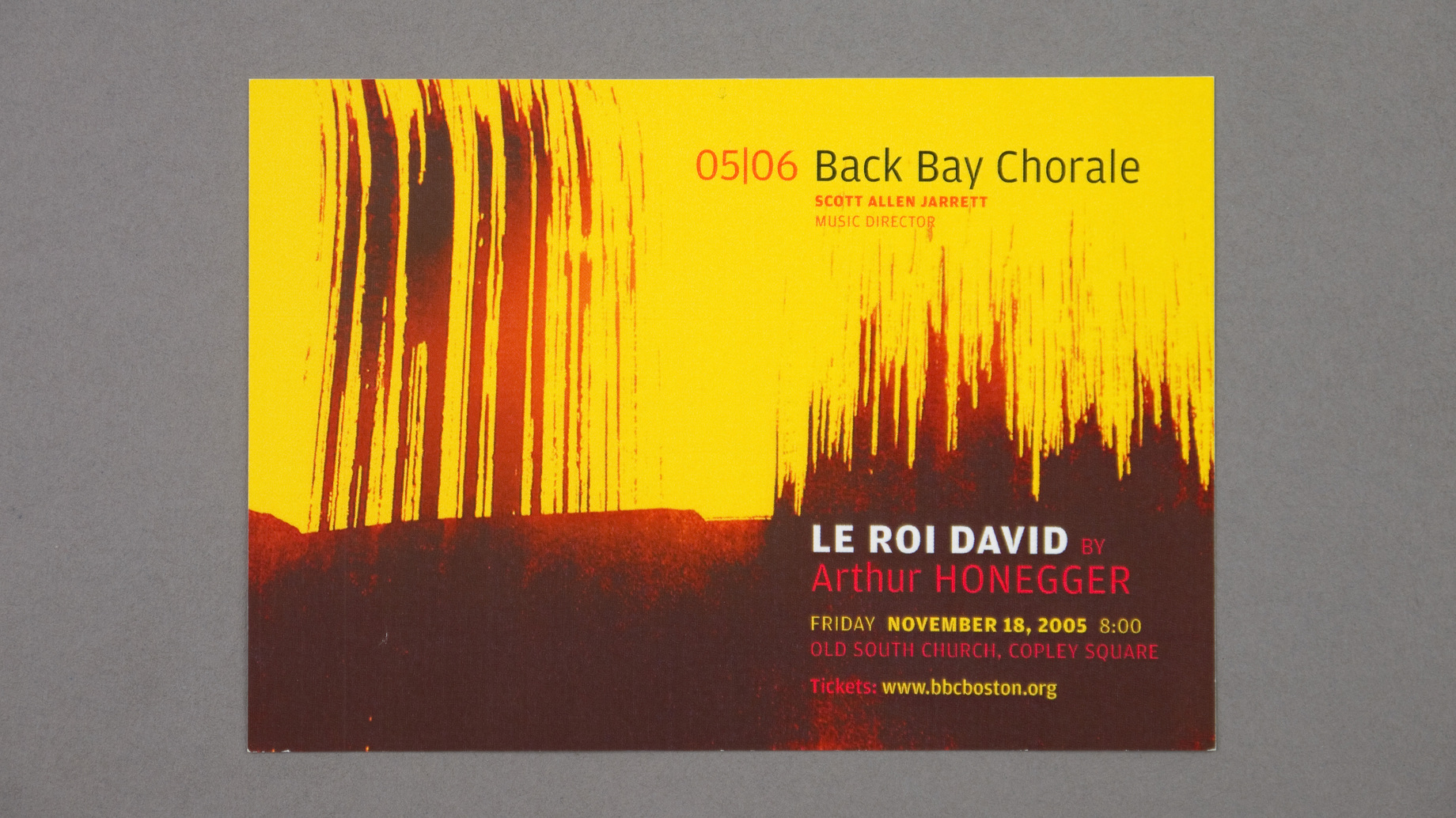
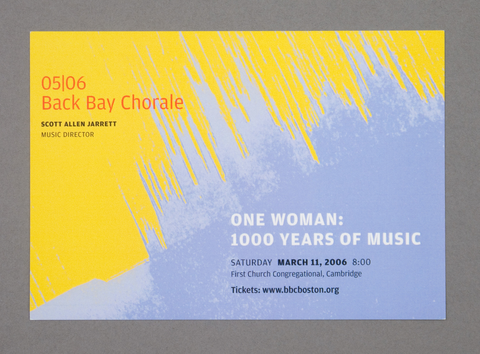
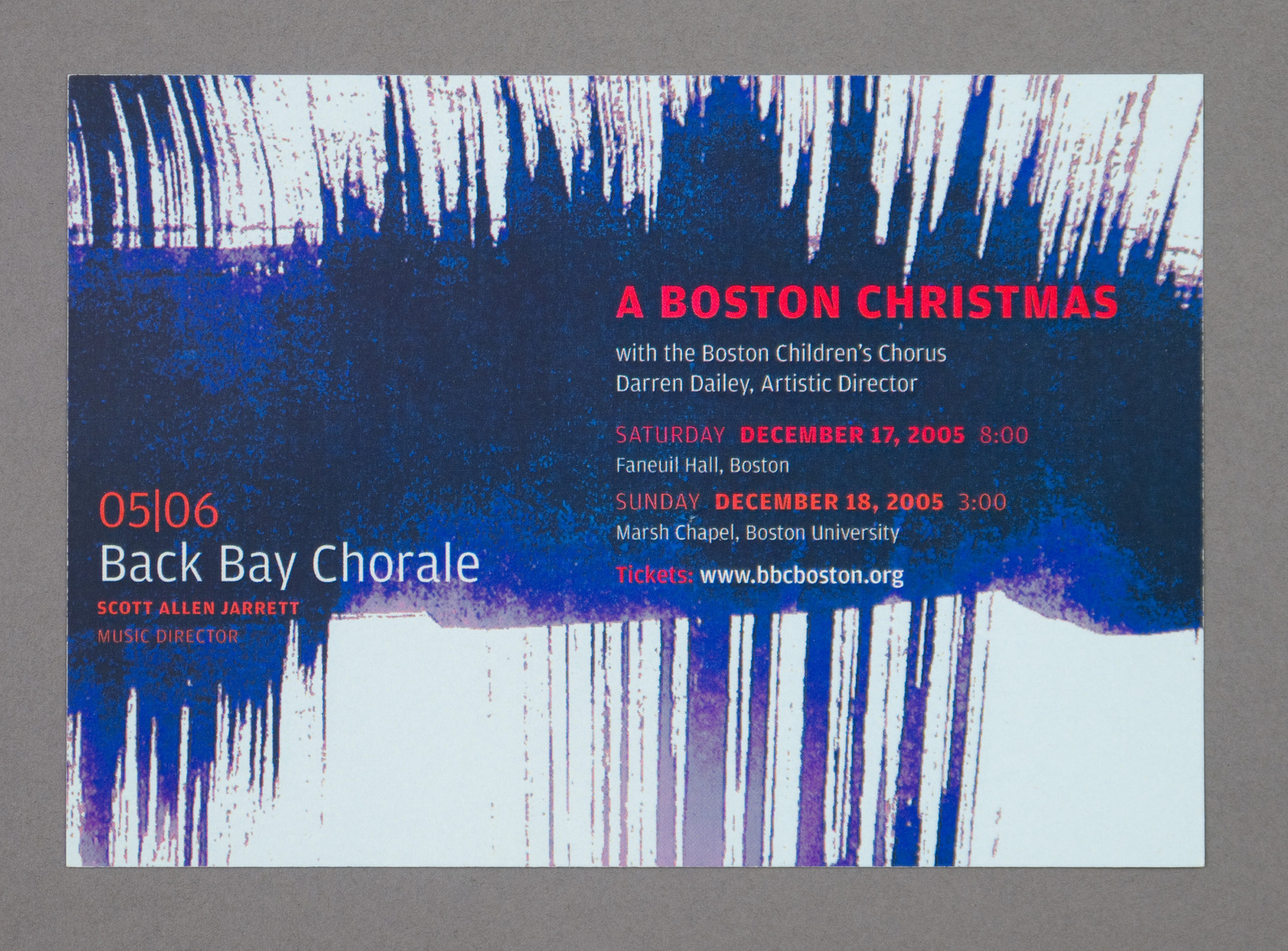
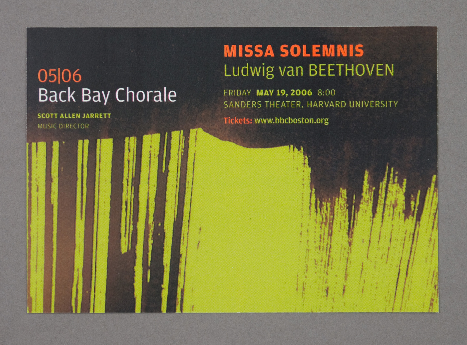
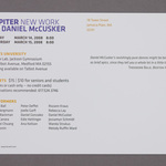
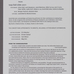
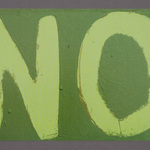
First season with Back Bay Chorale. They wanted "fire". Something to announce that they were different from other chorales in Boston. No time to do identity. I offered some simple and flexible typography (Font Bureau Amplitude), and set about exploring some visual material. (See them here.) They chose the brush stroke as the raw material. I was astonished at how easily — with color, cropping, rotation — the graphic could reflect back the content of the music in 4 very different concerts. Season brochure and poster printed offset. Postcards were printed digitally, alas.