


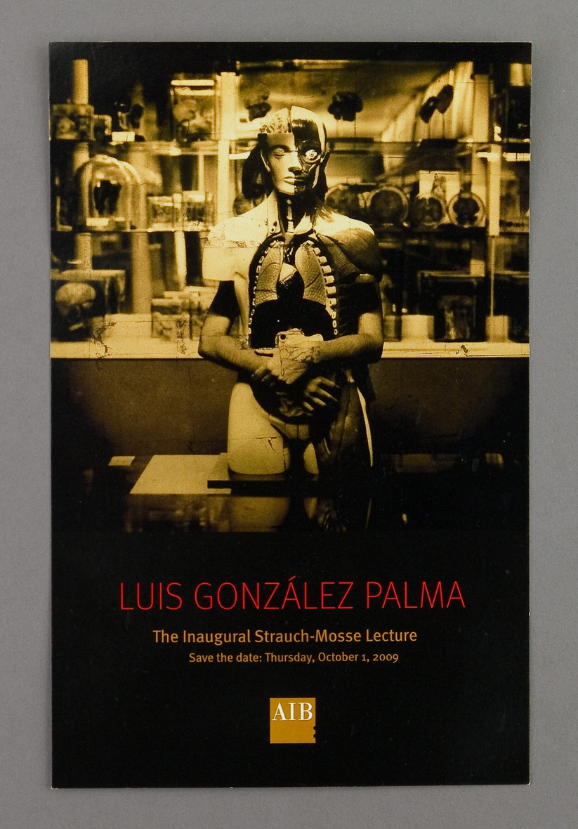
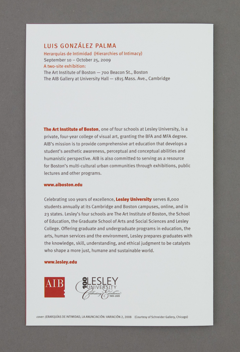
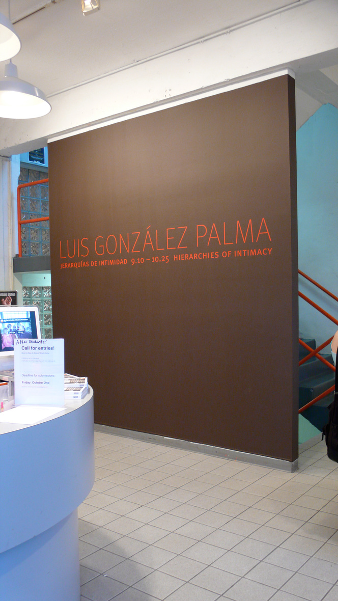
AIB Gallery: "Luis Gonzalez Palma — Hierarchies of Intimacy"
Use keyboard arrows (← and →) or click image to advance.


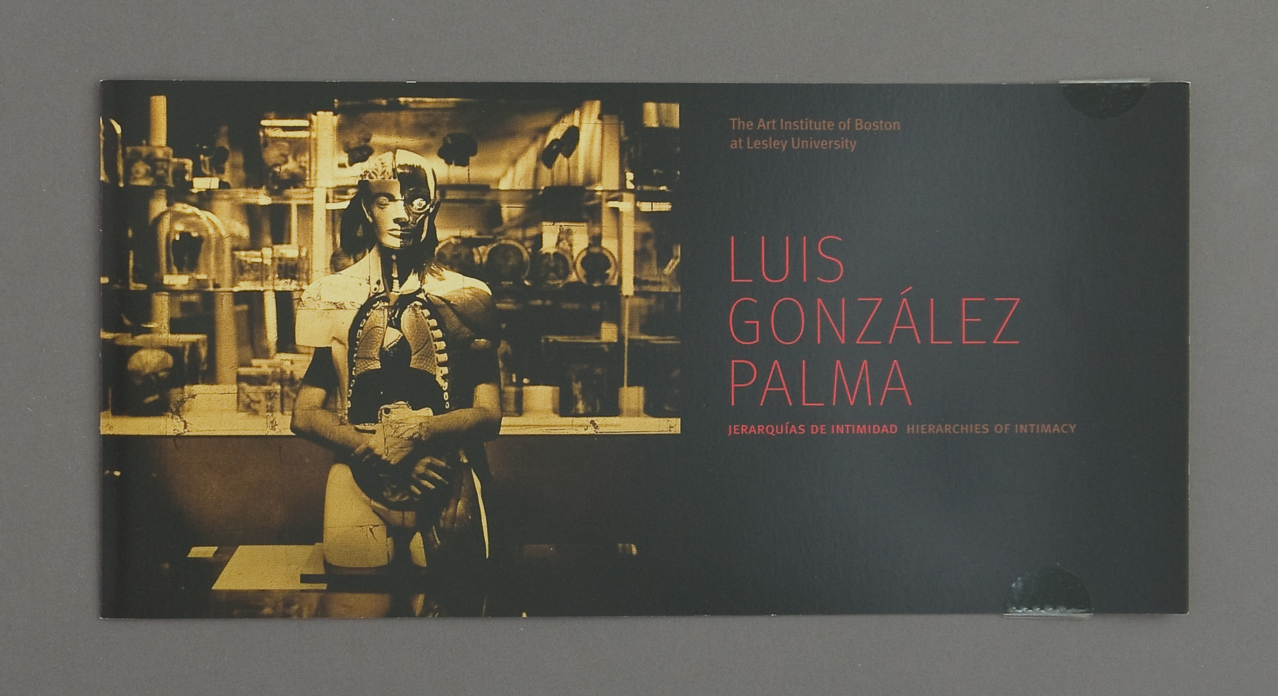
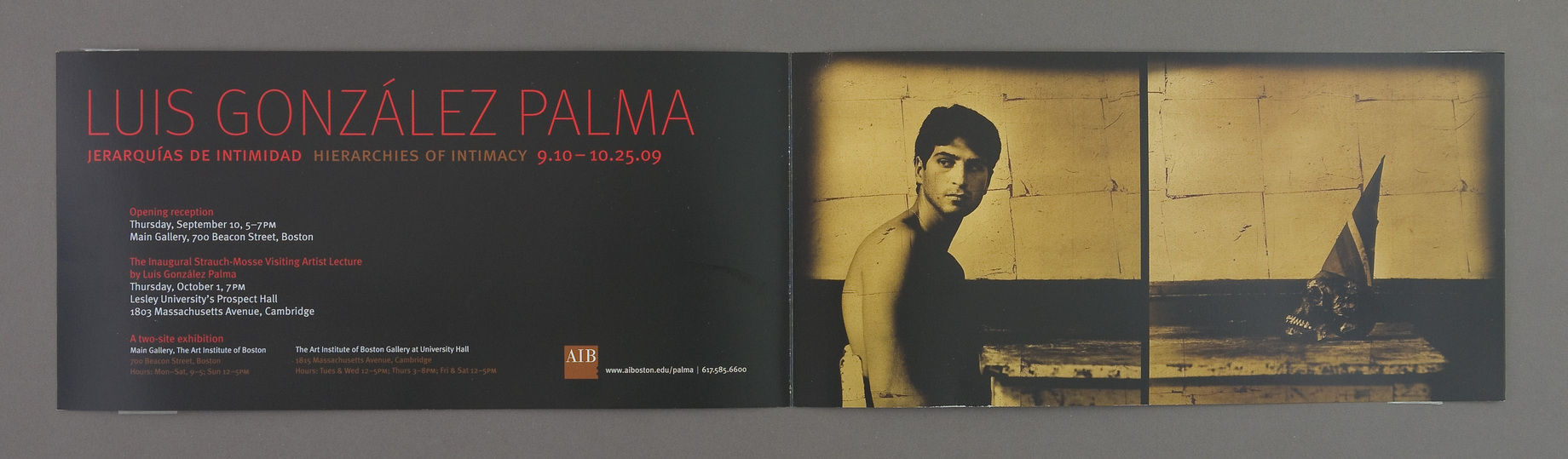
Don't think I have written elsewhere about the issues of designing for an art gallery. Basically, stand back. Try not to make the typography for Argentinian artist look ... "Latin". Try not to mimic the composition of the artwork with the design. When the art is not to my taste or just not graphically strong, I modify the stand-back rule and crop/decolor/combine with text, etc. No need here.
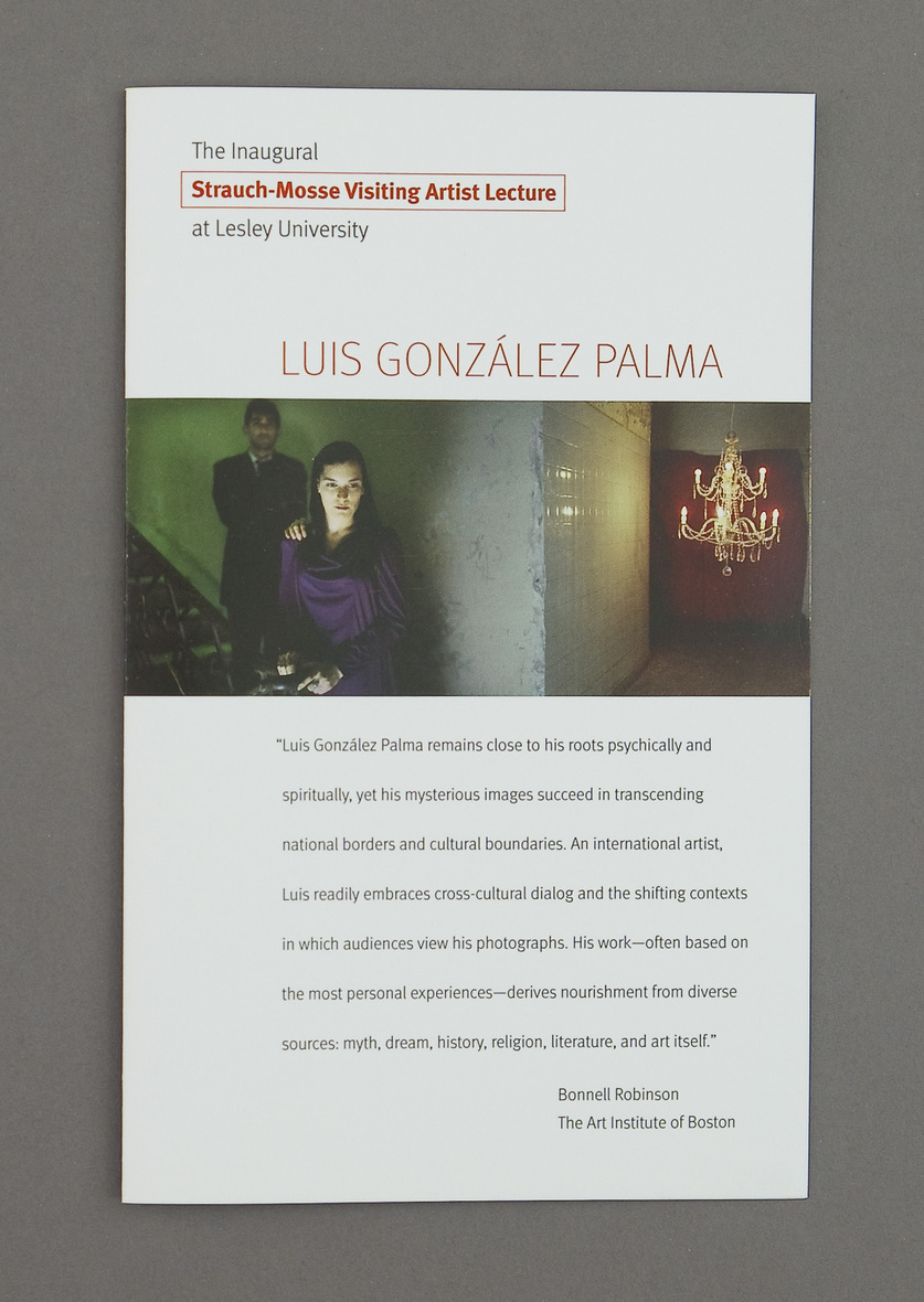
Here the problem was poor quality scans. All the images I was given were photos printed on gold leaf. On the scans it was a dull green yellow ochre, and barely enough resolution for the large poster. The pressure was on to make a splash, because of links to the Lesley Centennial and the inauguration of the Srauch Mosse lecture series. (His talk, in Spanish and translated, was mesmerizing.)Finally, after all the mediocre printing, and reprinting (from) mediocre scans was complete, I received some digital images shot from the originals. The difference was astounding. The gallery director had me use the new files for a few inkjet versions, which were fantastic. I'm including jpgs made from the digital files instead of my copy photos from the offset printed version.
JK, December 2010